/ That’s Amore! Cheese
- /Brand Strategy
- /New Brand Creation
- /Packaging Design
For the love of cheese.
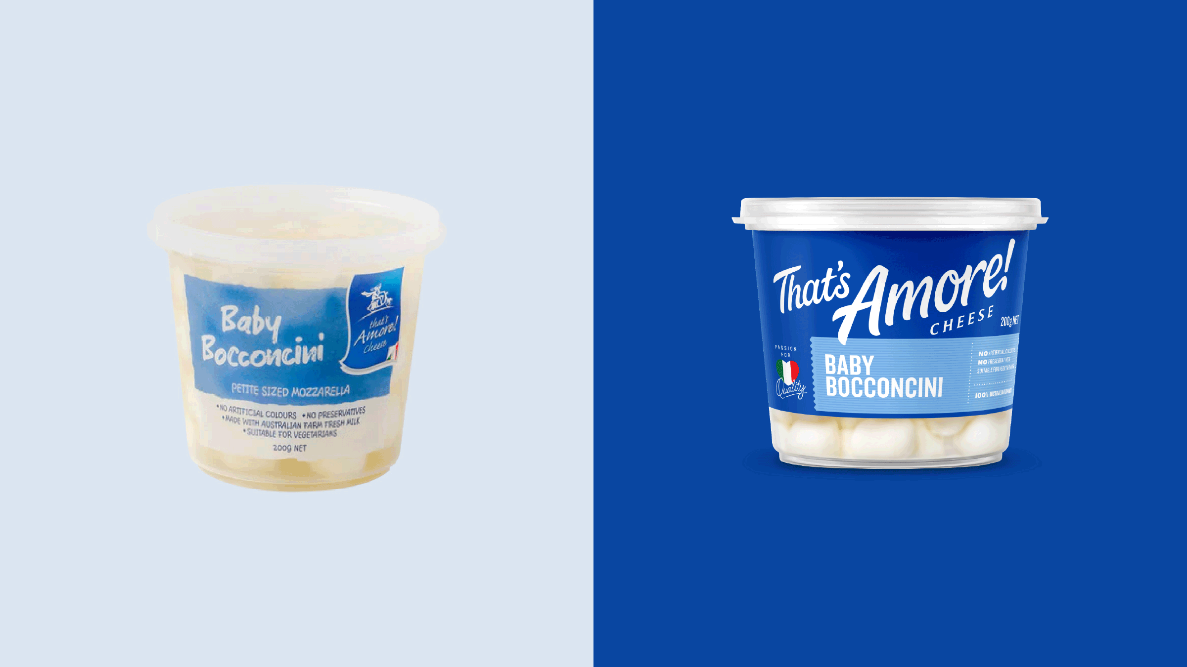
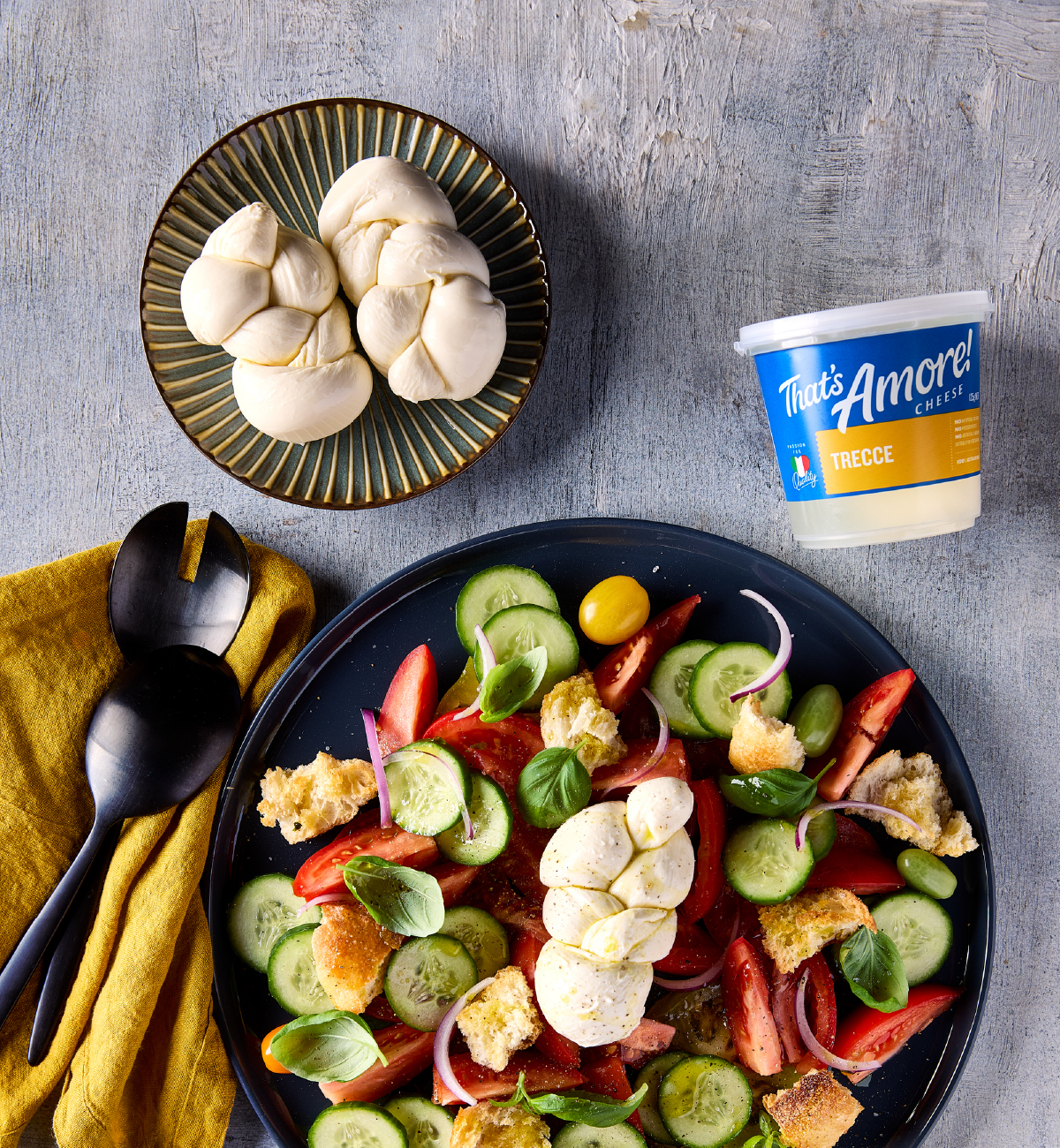
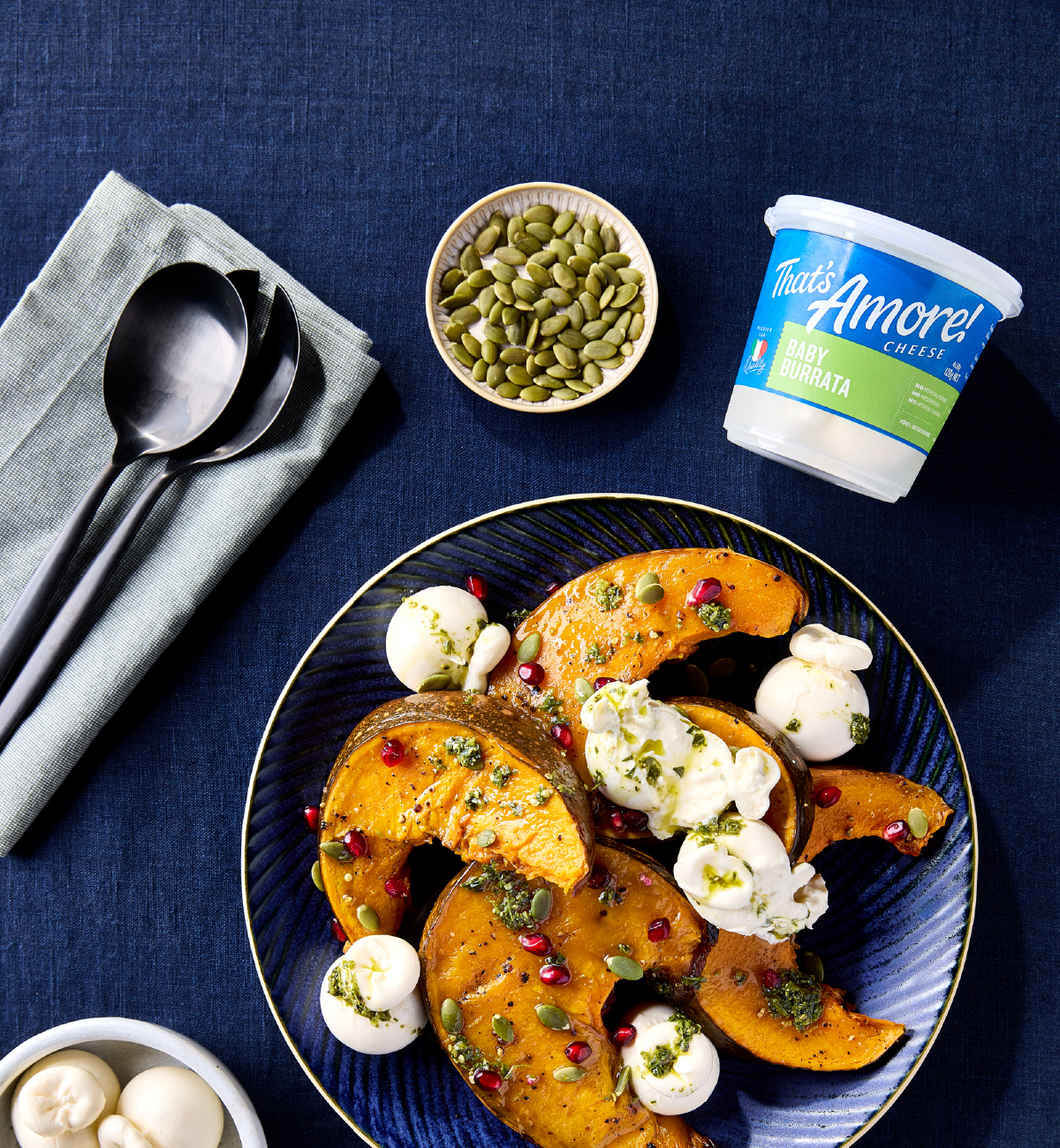
That’s Amore! Cheese was already loved by those who knew it – chefs, food lovers, and premium grocers who valued quality over scale. But the brand identity had fallen behind. The name often disappeared on shelf, overshadowed by generic cues and inconsistent design. For a brand built on passion, it lacked visibility – and voice.
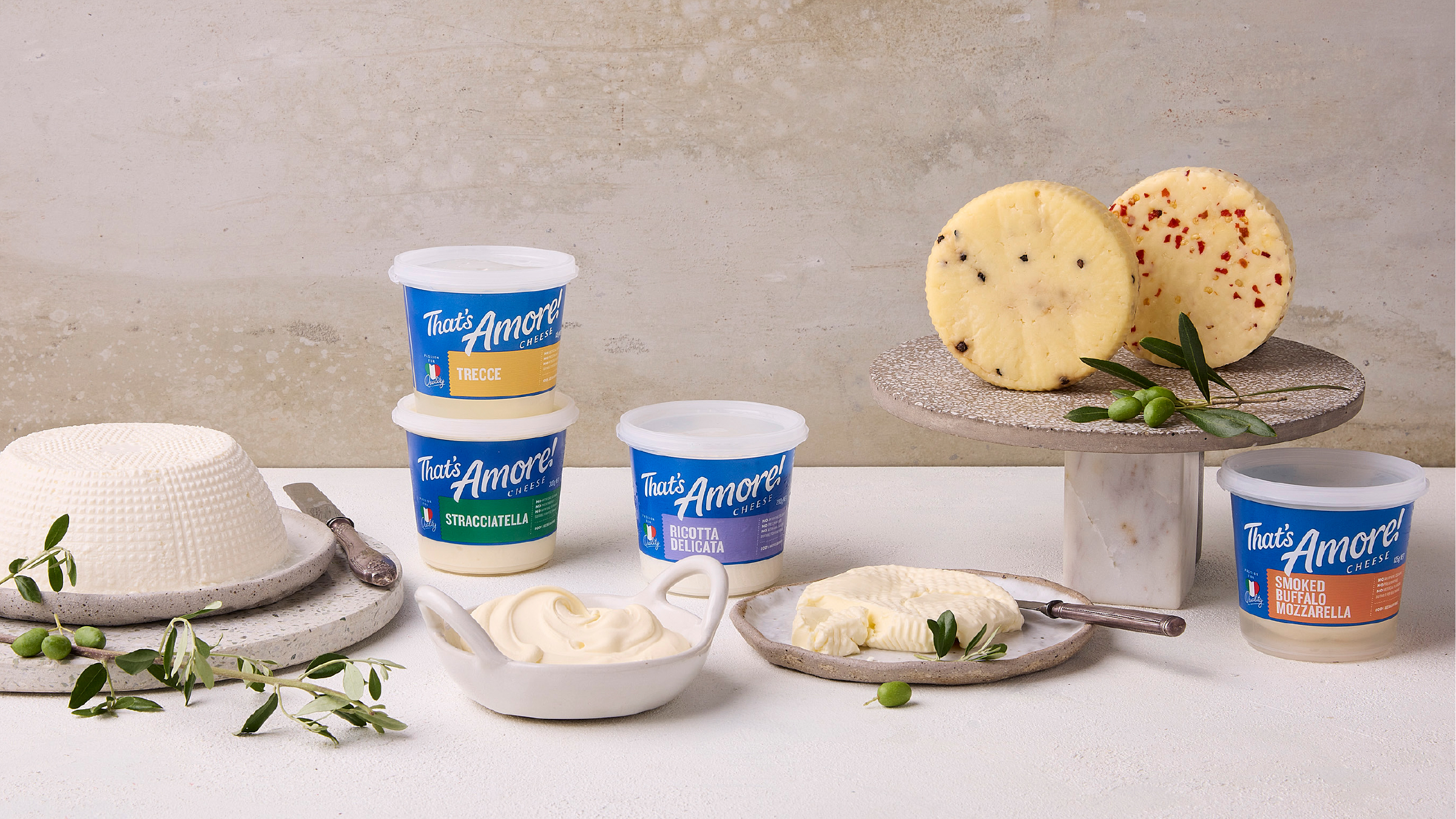
We brought the Amore! back. The refreshed identity places Giorgio Linguanti – the Sicilian cheesemaker behind it all – at the centre of the story. A bespoke, hand-drawn logotype, expressive and full of personality, reclaims the brand’s name and energy. A bold Azuri Blue creates powerful shelf blocking and a distinctly Italian freshness. Typography, variant systems and back-of-pack storytelling were all redesigned to feel modern, heartfelt and unmistakably That’s Amore!
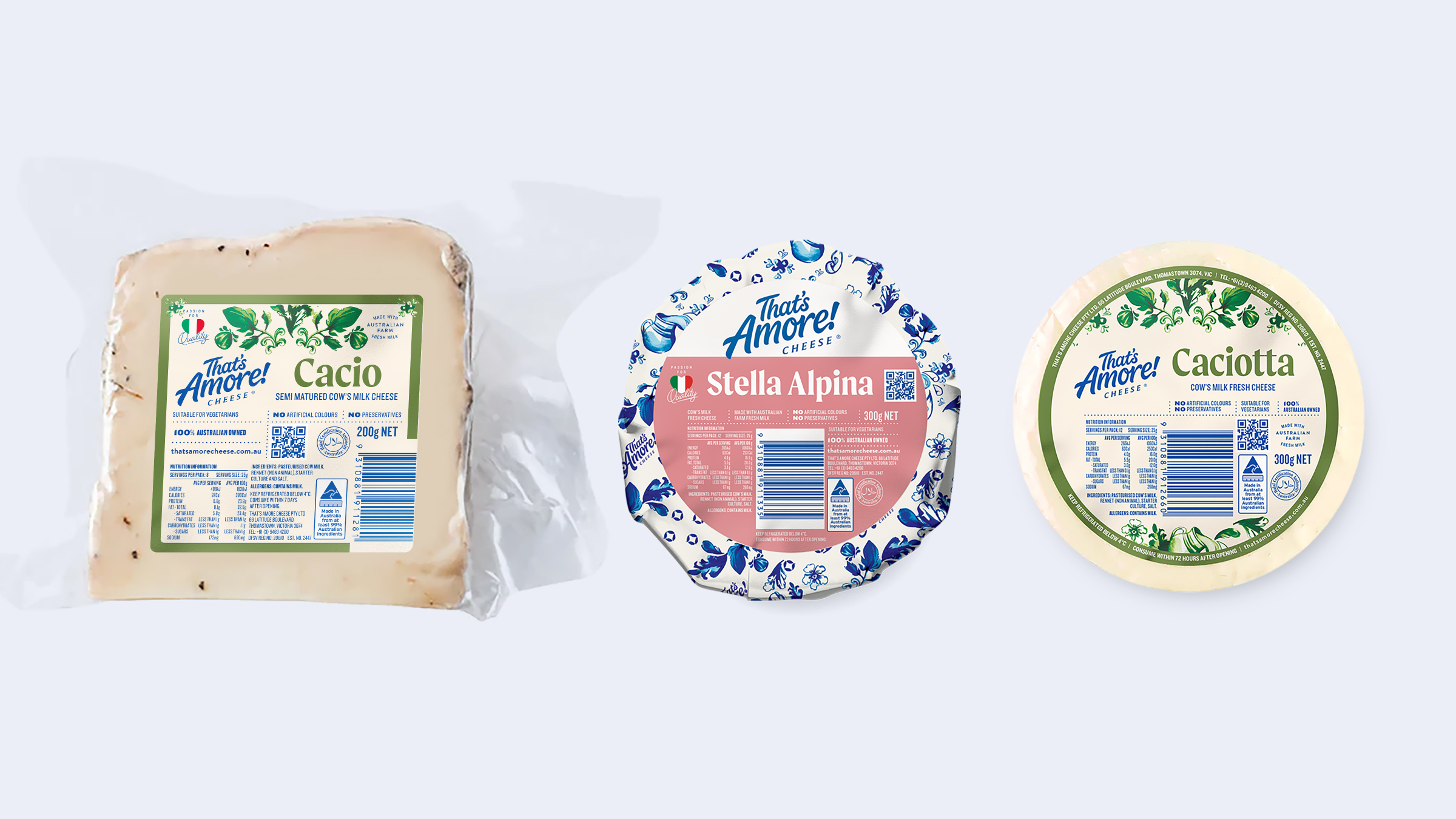
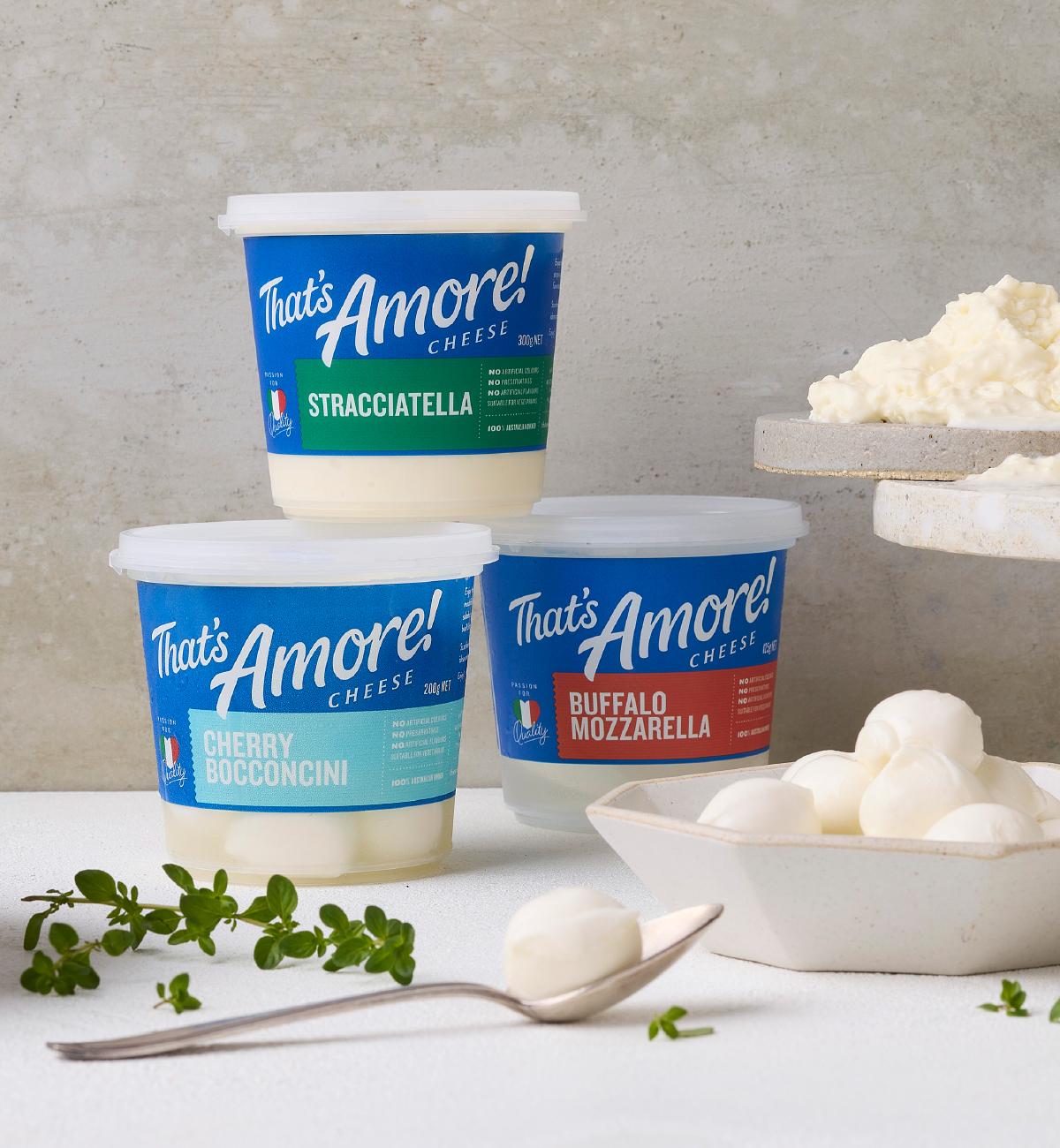
The result is an identity that stretches confidently across fresh tubs, premium ranges and high-end hospitality – from Thomastown to Chadstone. It feels unified, elevated and ready for growth. But more than that, it brings back the joy, generosity and La Dolce Vita spirit that defined the brand from day one.
And yes – it’ll have you humming Dean Martin all the way home.
Photography: Bonnie Savage
/ “This brand is my heart. It’s about love – for food, for tradition, for bringing people together.
”