/ Sirena
- /Packaging Design
- /Innovation
Rediscovering classic simplicity.
Sirena had become No.2 in tuna, but success had led it down a path of becoming more like everyone else. It needed to rediscover its authenticity.

Australians love Sirena. They love the quality, the taste and what the brand represents – classic Italian simplicity. But with growth comes growing pains and shoppers were starting to pick up the wrong flavours by mistake.
Our brief was to improve visual navigation cues, but we discovered Sirena’s packaging was virtually the same as its competitors. Only the logo and brand colour we different. Same layout. Same descriptors. Same photography. There was a larger opportunity here to rediscover Sirena’s authenticity and visually express it in a way that was distinctive and memorable.
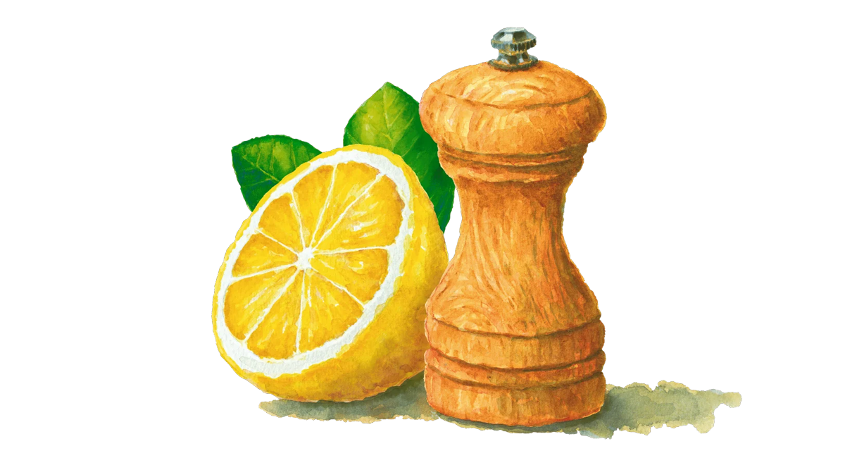
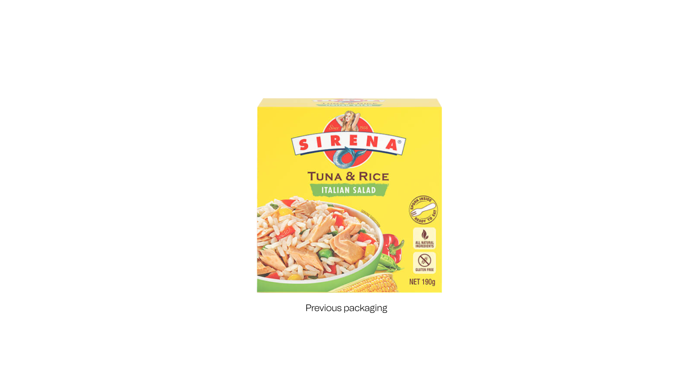
A lot of small changes made a dramatic difference, like introducing watercolour illustrations, Italian-inspired typography and a more sophisticated colour palette. However it was Ready-to-Eat meals where the new approach would be most rewarding. Changing packaging from a carton to a sleeve now enabled shoppers to see the quality of the product for themselves. Photographing the product from above and using it at actual size created quality you can see while disrupting at shelf amongst a sea of sameness.
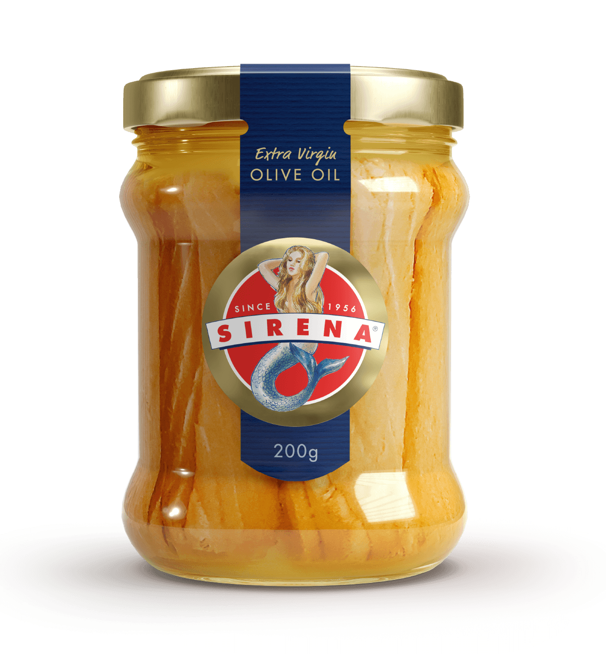
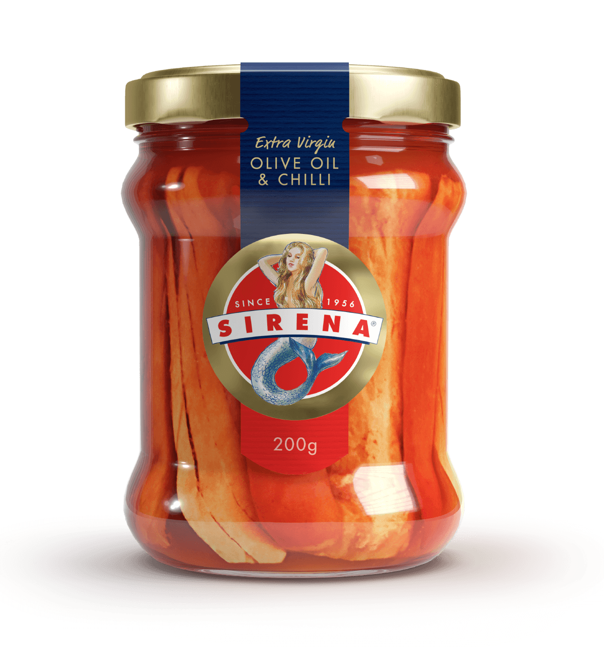
We refreshed the Sirena Tuna & Beans to better communicate the product proposition and inspire usage, and ran an innovation workshop that yielded countless new product ideas, one of which being the beautiful Sirena Premium Tuna Fillets in a jar.


/ “Great news! We’ve had a significant increase across the range with all products in growth and performing more strongly. The meals range has already seen a 35% uplift in sales and we expect that to grow even further.
”
