/ Sara Lee
- /Brand Strategy
- /Brand Identity
- /Packaging Design
Tastes like home.
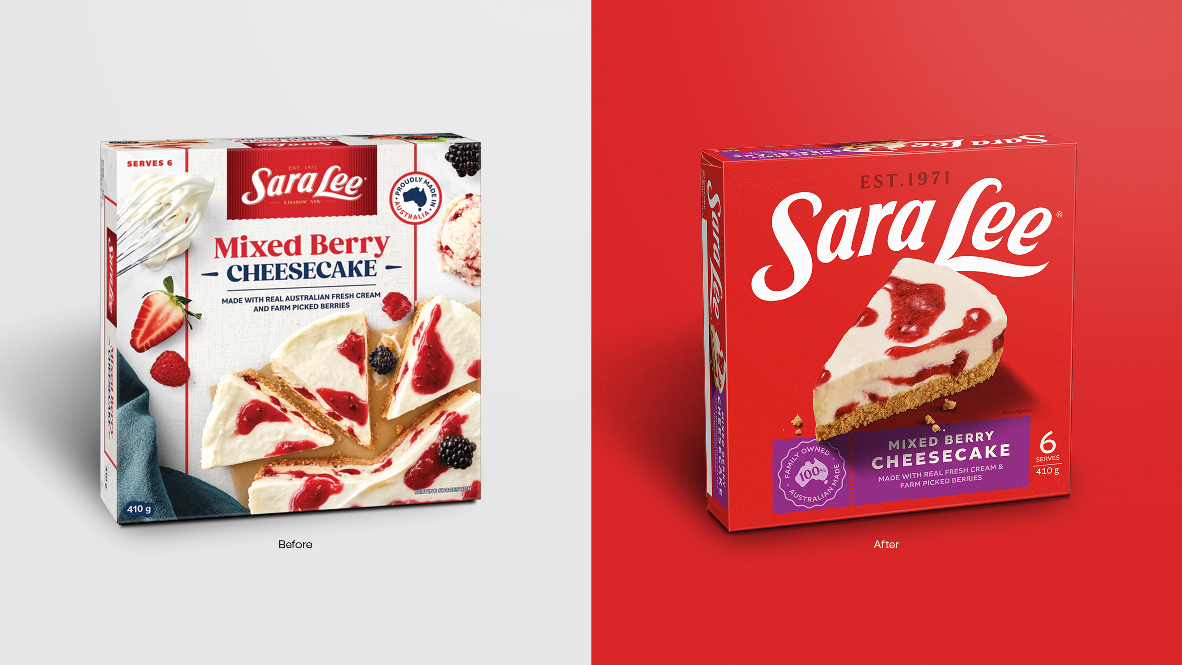
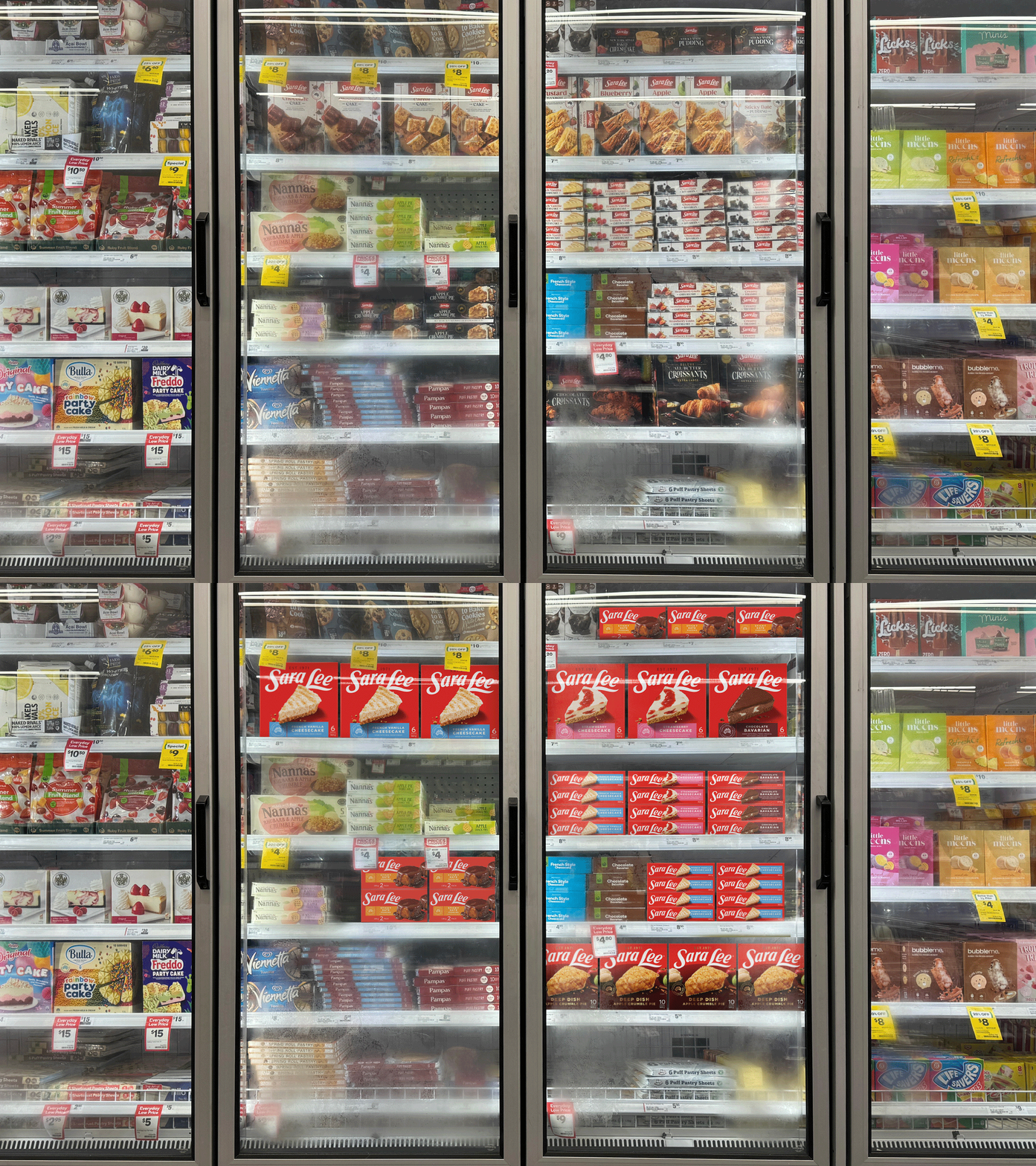
Sara Lee had become invisible. Once a beloved fixture in Australian freezers, the brand had lost cultural relevance and on-shelf distinction. Following voluntary administration, the new owners saw an opportunity – not just to rescue a legacy, but to reignite its place in people’s lives.
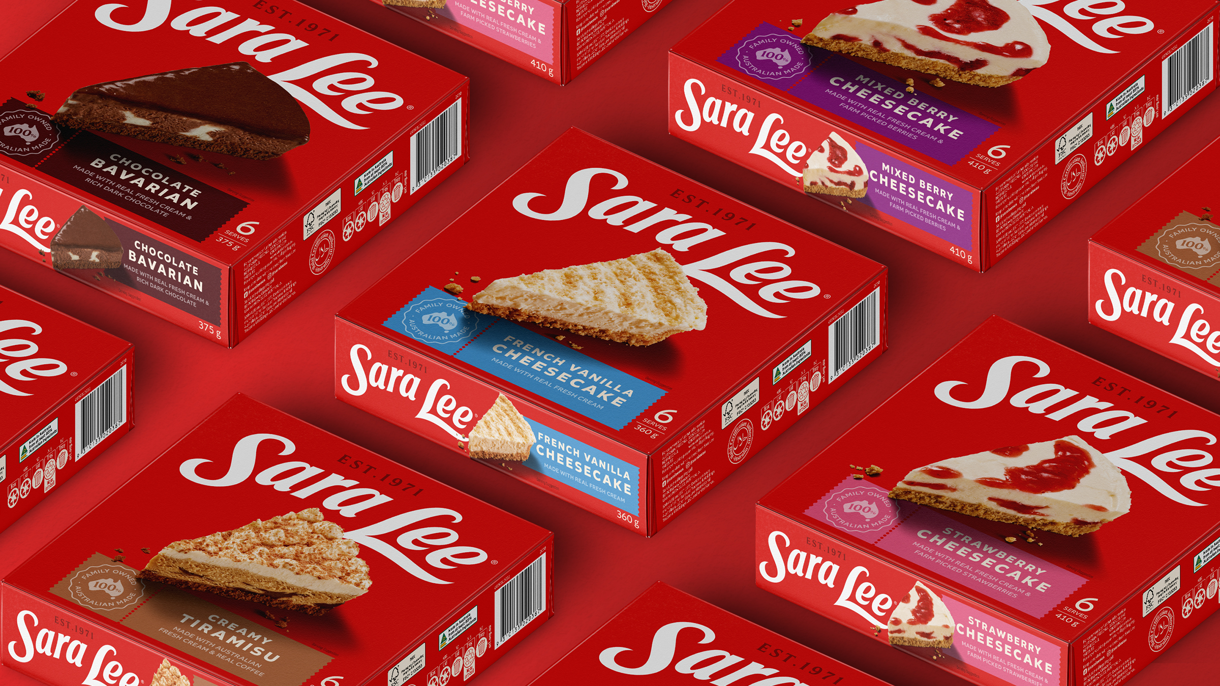
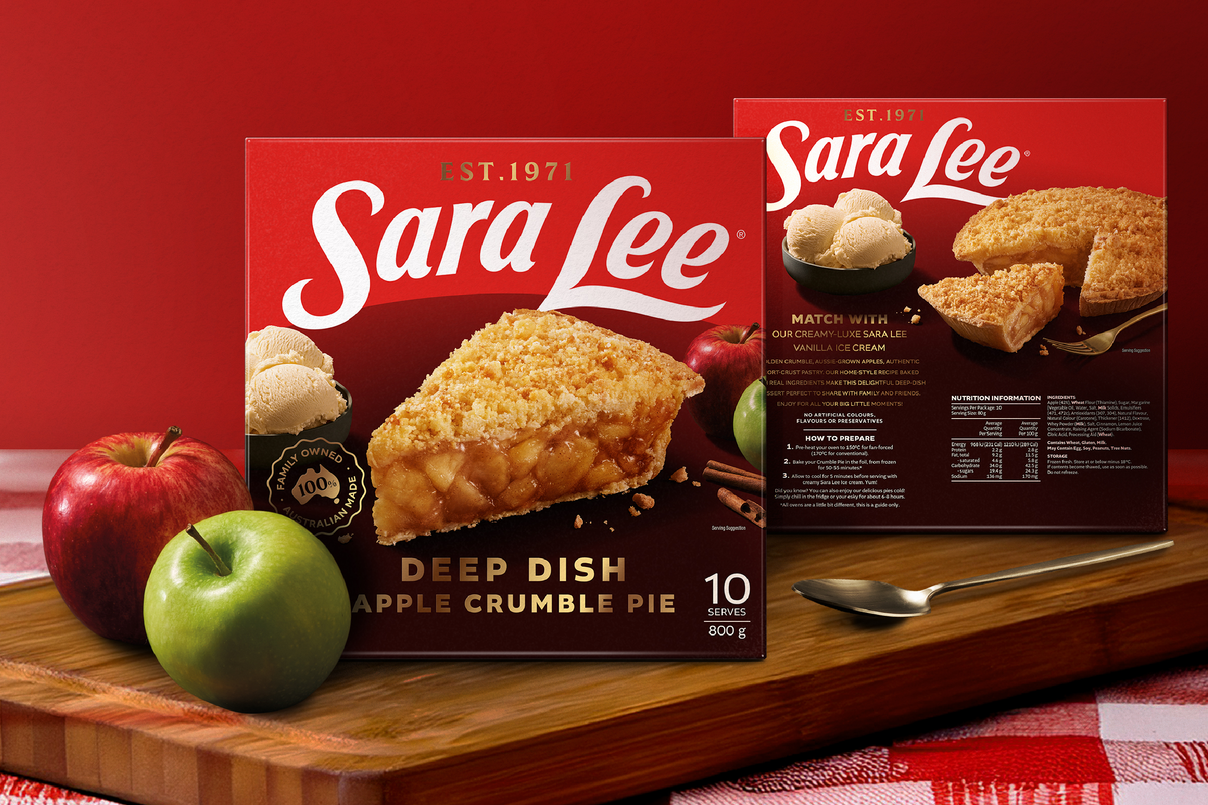
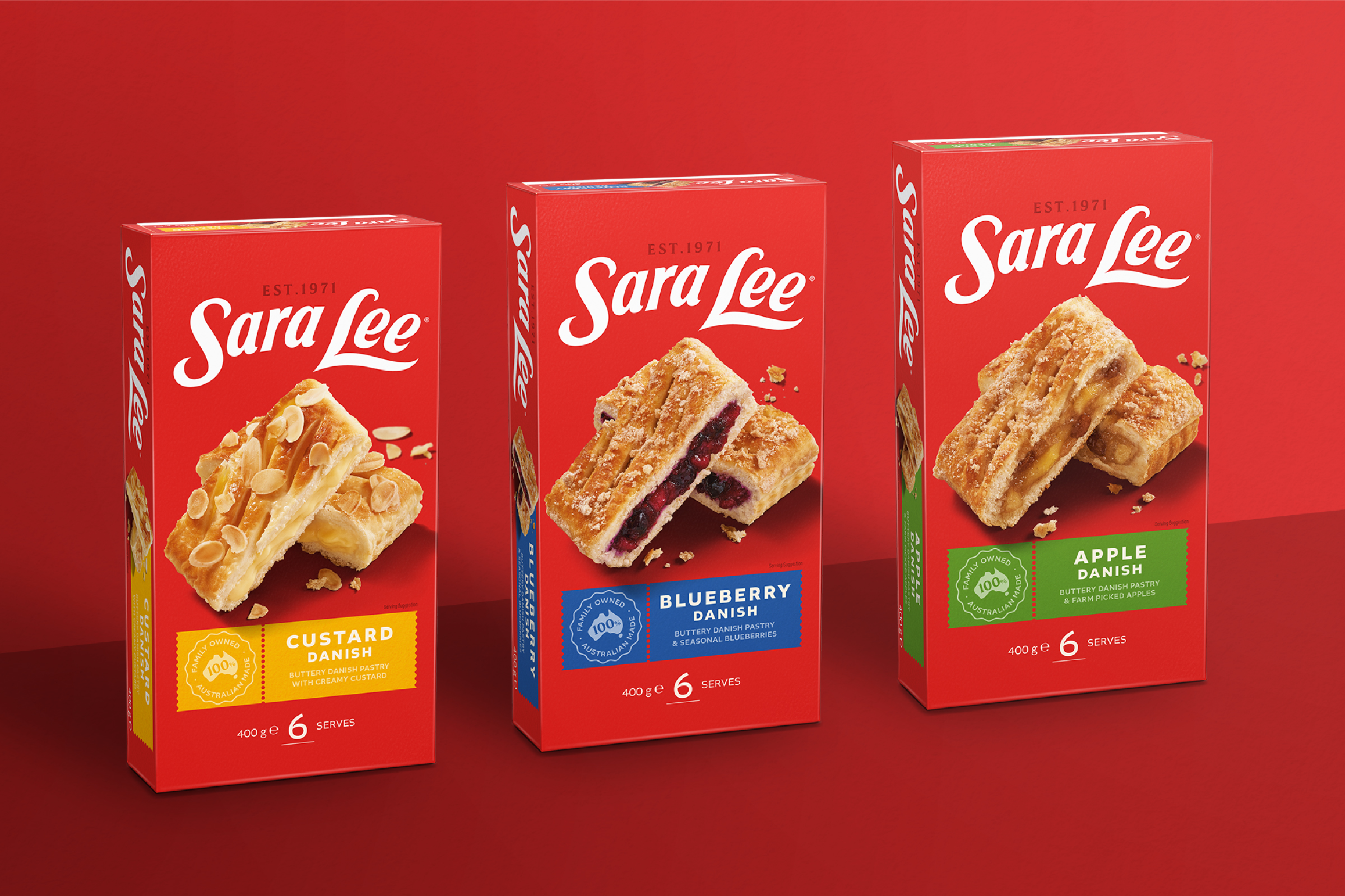
Our strategy centred on a simple truth – Sara Lee tastes like home. This idea guided a complete brand evolution – from positioning and identity through to packaging design and photography. The refreshed brandmark now sits confidently on a bold red canvas. Food styling is generous, honest, and full of appetite. The tone of voice brings warmth and soul to everyday rituals, reclaiming Sara Lee’s role in both the celebratory and the everyday.
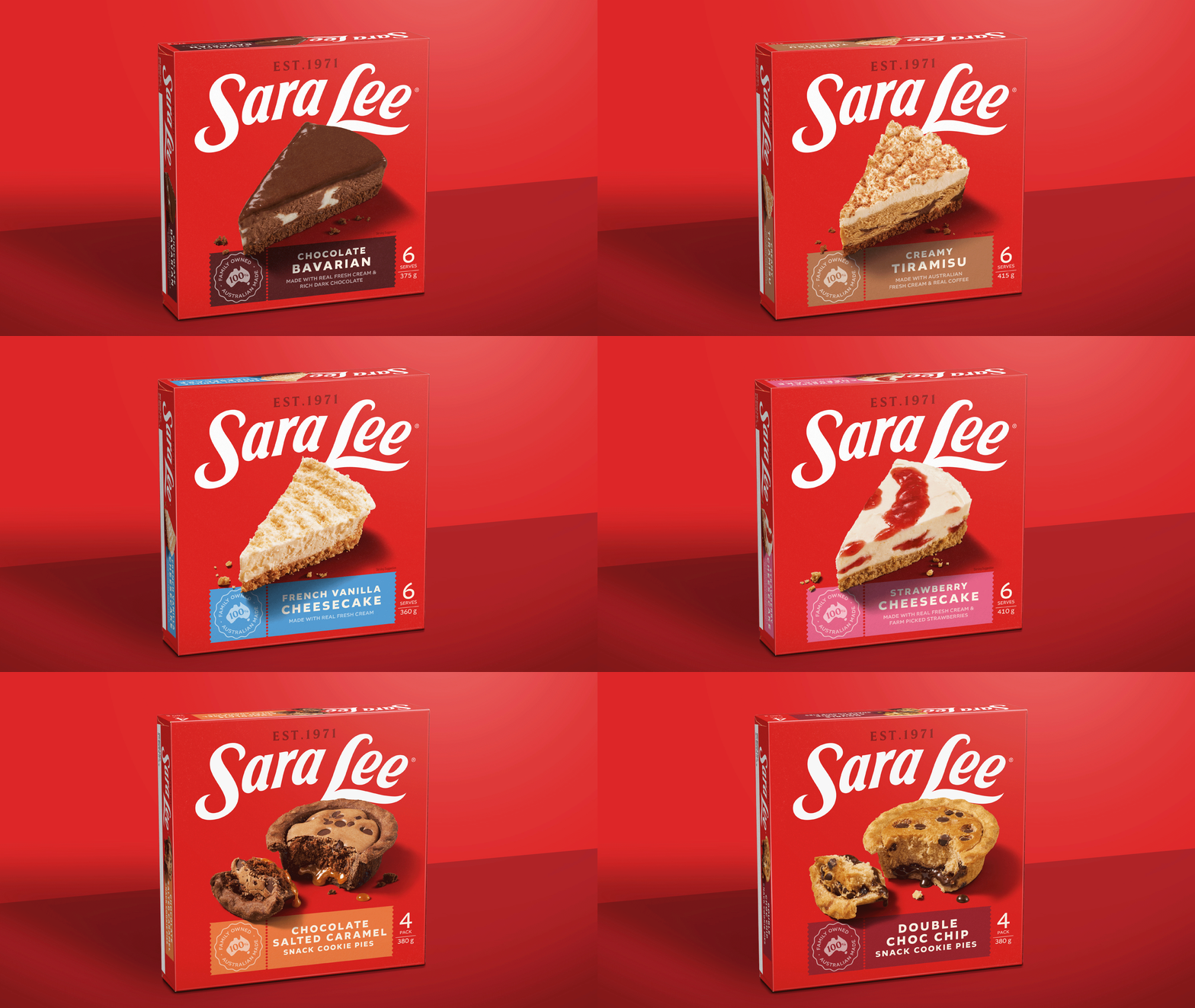
The new identity didn’t just look the part – it changed how people felt. Industry and consumers responded in kind, with renewed recognition, affection and momentum. It put Sara Lee back on shopping lists, back in conversations, and into new categories.
Awards
World Brand Design Society 2025 Gold and Black Awards
Transform ANZ 2025 Silver – Best brand evolution, consumer
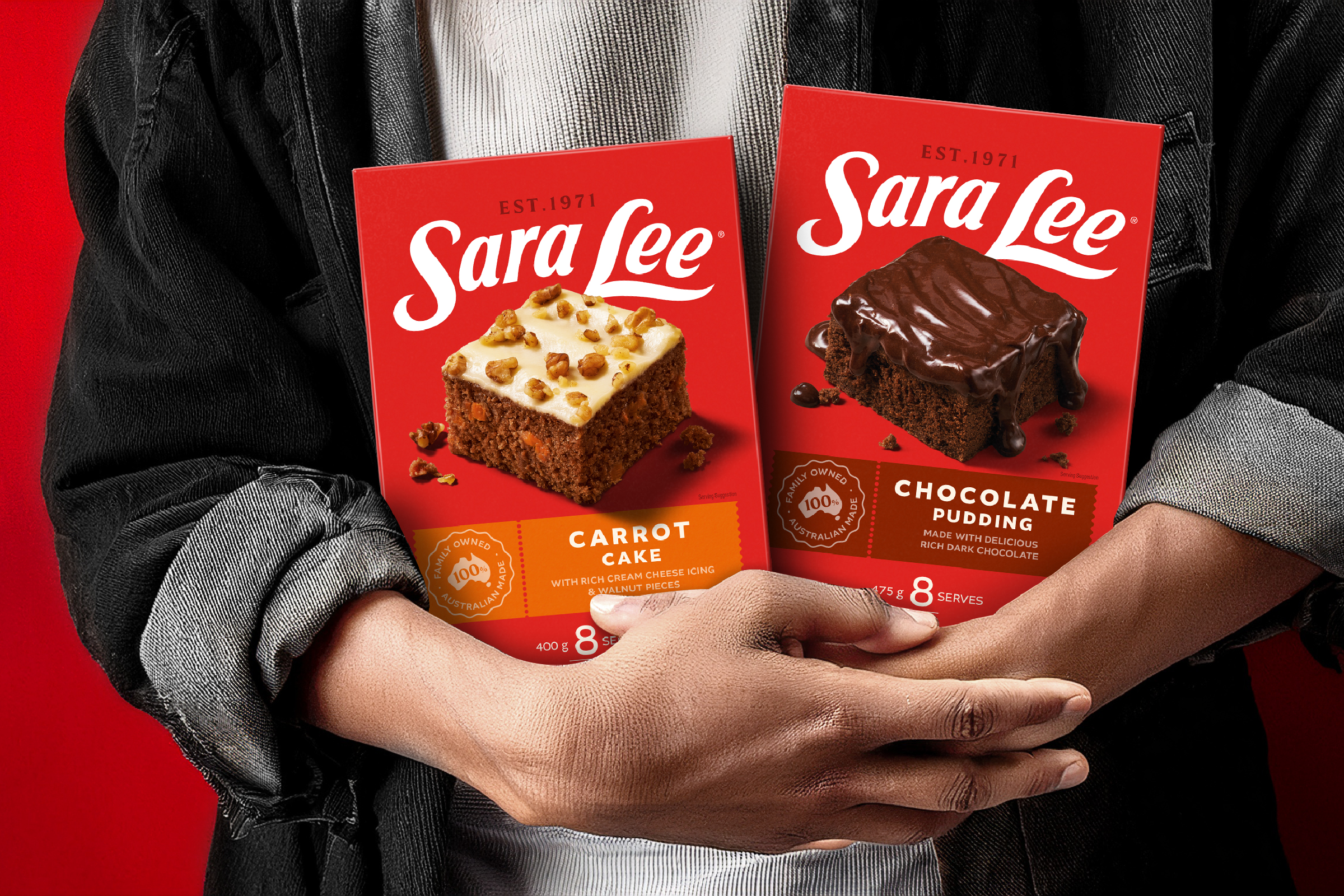
/ “This marks more than a packaging change – it’s a mindset shift. Red is for love. It’s bringing us home to who we really are.
”
