/ Melbourne Symphony Orchestra
- /Brand Strategy
- /Brand Identity
- /Communications
Shape of sound. A brand in motion.
The Melbourne Symphony Orchestra is one of the nation’s most enduring cultural institutions – but its visual identity no longer reflected its creative ambition or the city it represents. The challenge was clear – reimagine MSO for a new era, while respecting the weight of its 120-year legacy.

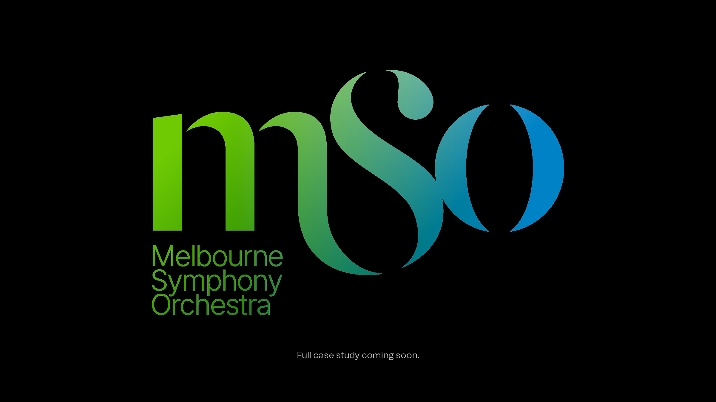
The new brand centres on a bold organising idea – Shape of Sound – expressing the power of music to move us, physically and emotionally. Custom-designed letterforms form a living monogram. The M holds rhythm. The S curves like a conductor’s gesture. The bracketed O holds resonance – like the ring of a final note.
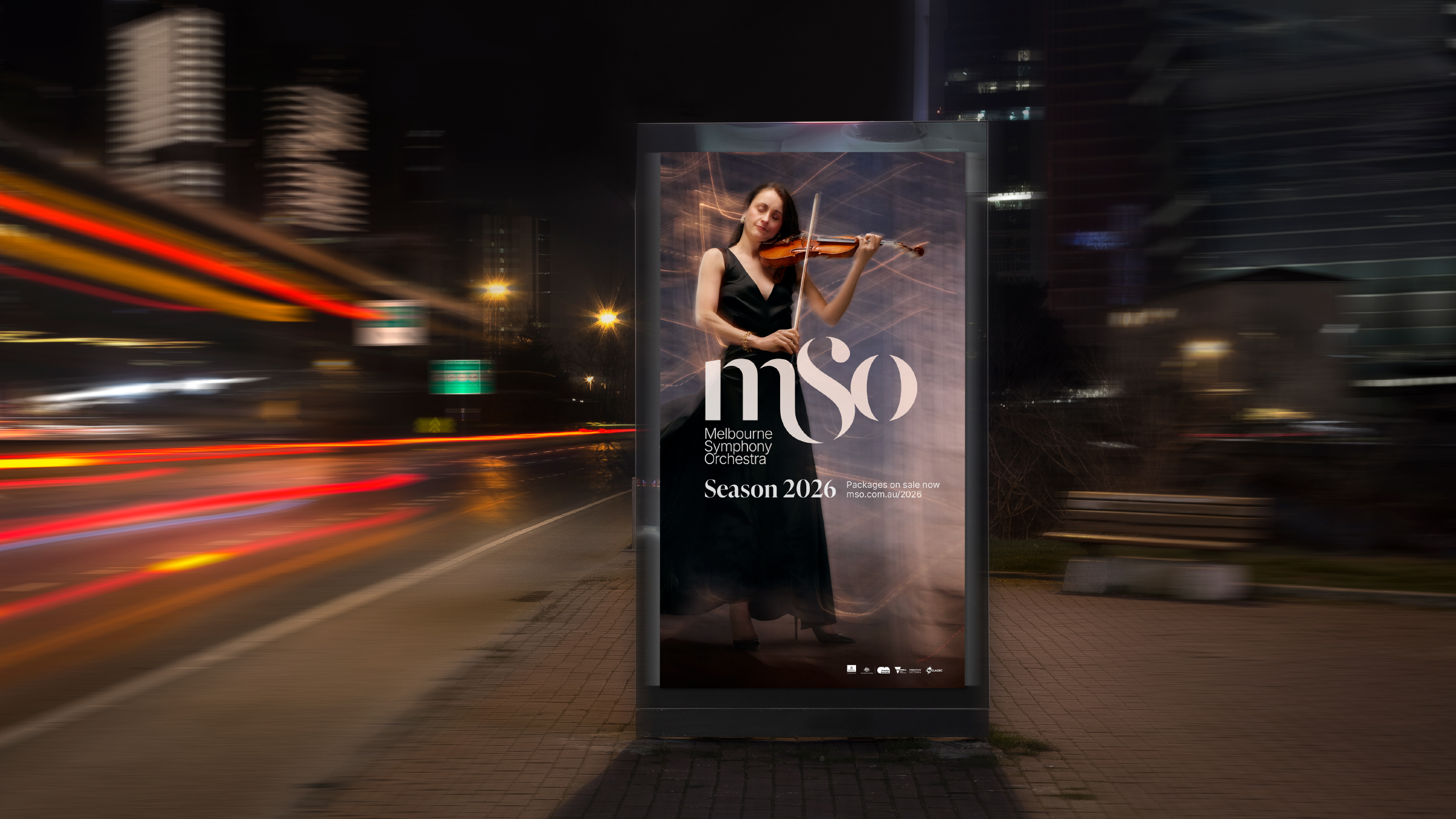
Built from motion, the identity flexes across campaign, digital, stage and score. From typographic stencils and visual devices to a full brand toolkit, everything is designed to feel alive – as dynamic as the performances it represents.
The result is more than a visual update. It’s a cultural repositioning – a shift from institution to creative force. A brand that puts MSO in step with Melbourne’s artistic energy, while projecting its stature on the global stage.
Photography: Lucas Allen

/ “This brand has unified and energised the organisation – from our musicians to our board, from our audiences to our partners. It captures who we are, and where we’re going. Disegno have created something truly transformative: a brand that expresses our soul and strengthens our strategy.
”