/ Keeper’s Glove
- /Brand Strategy
- /Brand Identity
- /Packaging Design
Crafted with respect, spirit and integrity.
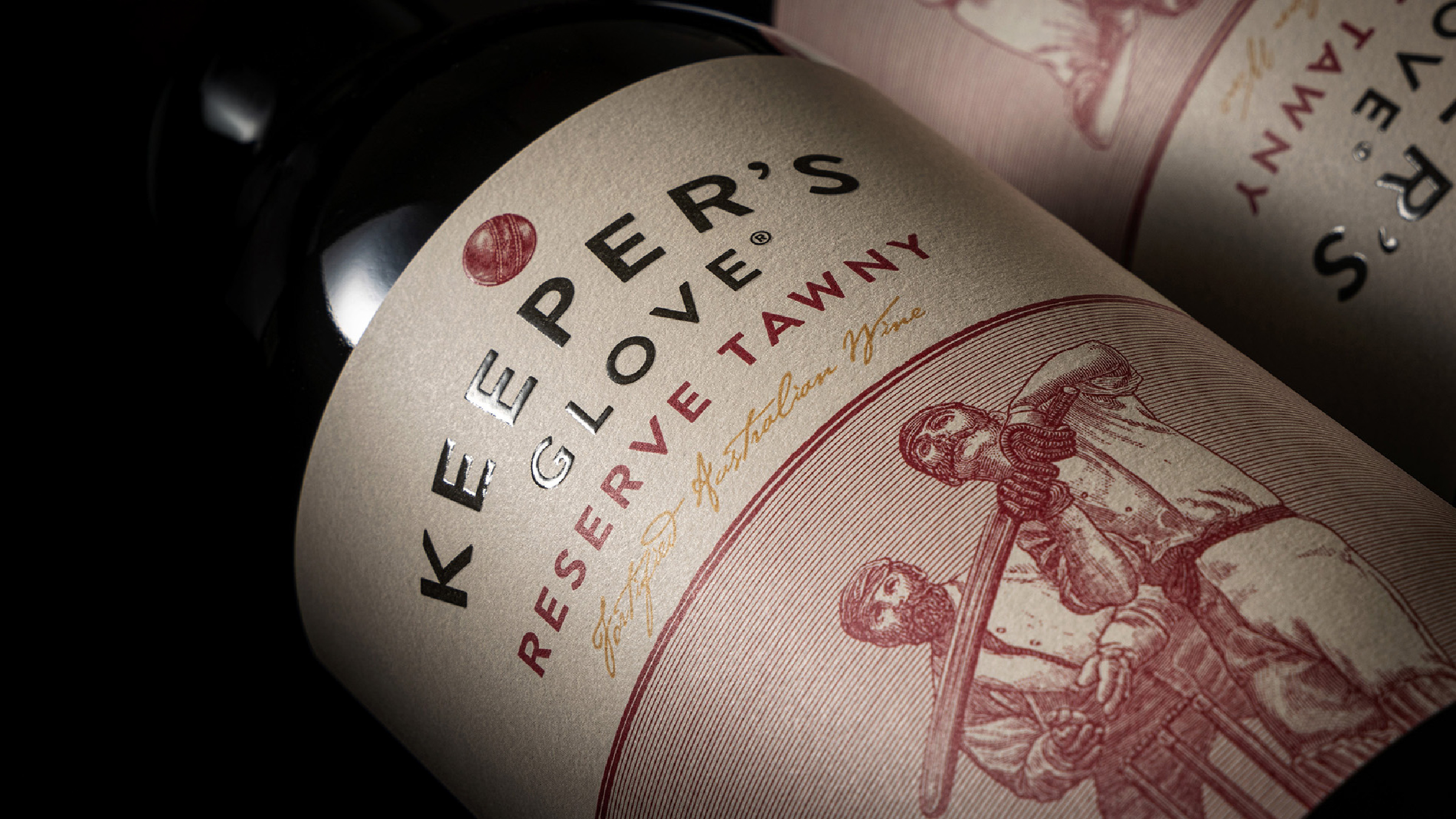
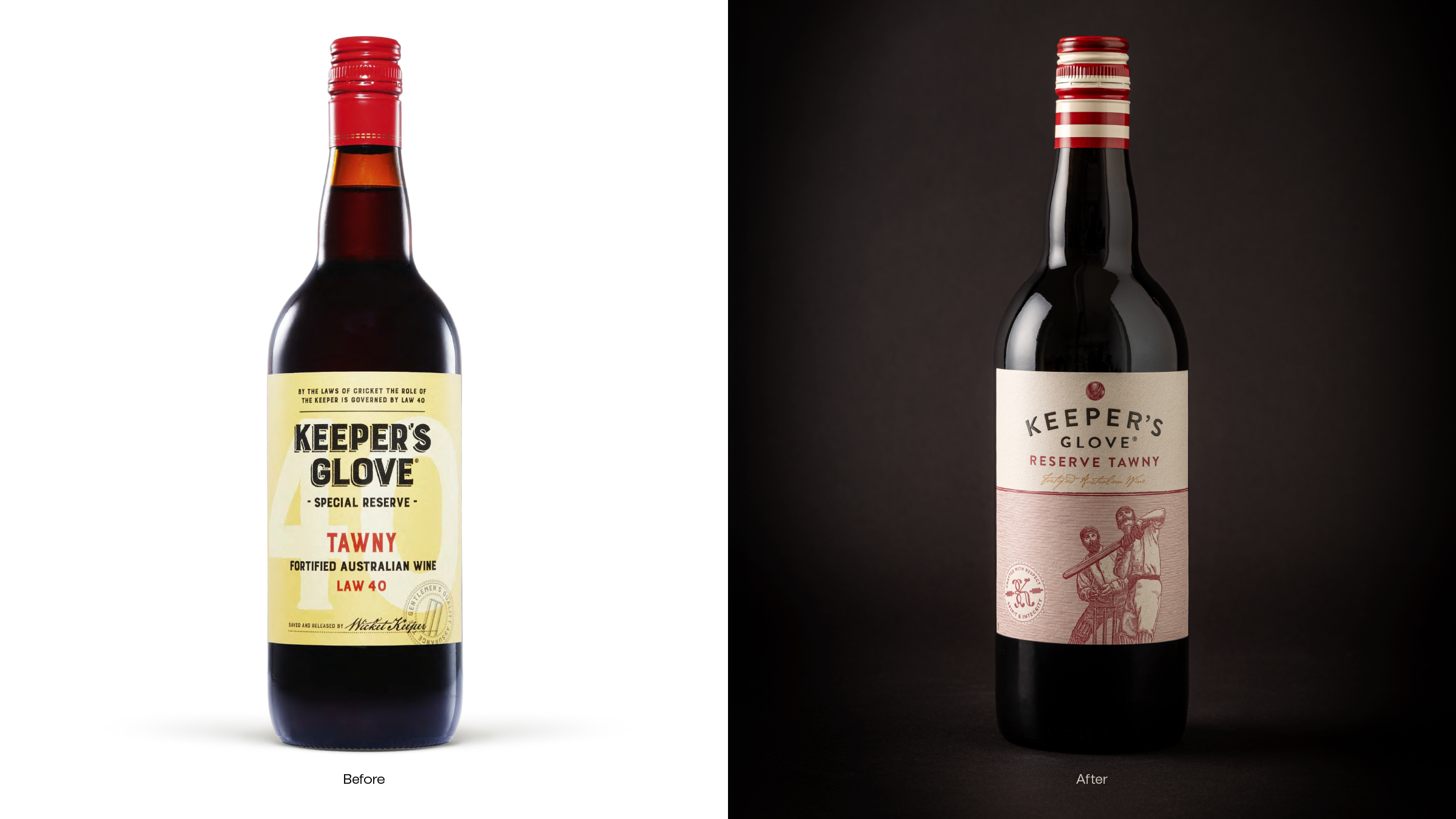
Keeper’s Glove® Reserve Tawny masterfully reinvents the port category by blending timeless sophistication with cricket’s cherished camaraderie. Crafted with respect, spirit and integrity, the design refresh elevates perceptions from ‘my grandfather’s port’ to a coveted choice for modern indulgence.
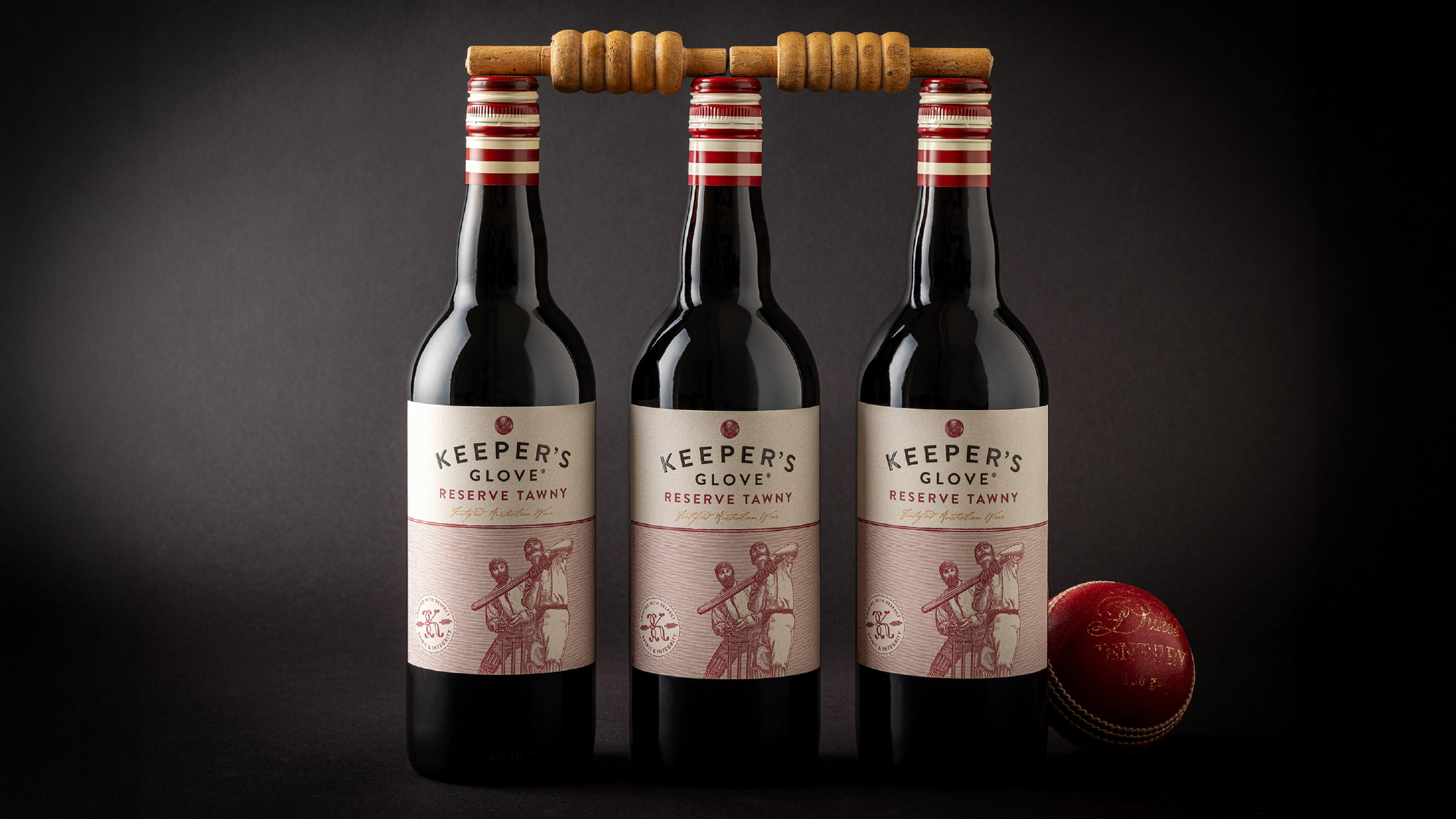
The cream, textured paper label, paired with understated typography, exudes premium quality while staying accessible. A vintage cricket illustration featuring a batter and a keeper’s catch invites shoppers into a world of tradition and storytelling, celebrating cricket’s timeless spirit. The red and cream striped capsule delivers a touch of modernity, ensuring striking shelf standout in the value-mid segment.
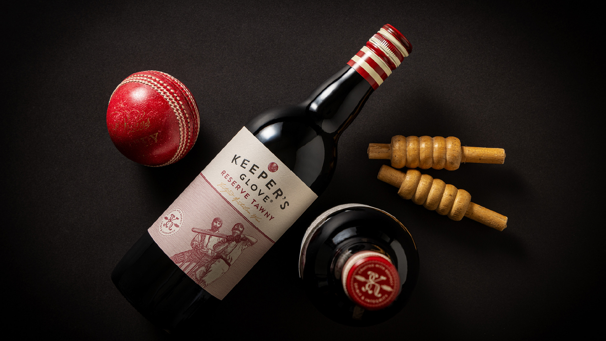
This visual narrative seamlessly connects the craftsmanship of winemaking with the discipline of cricket, expanding appeal from Value to Occasional consumers seeking a sophisticated yet relatable choice for special occasions. Keeper’s Glove® captures more than flavour – it delivers a sense of place, purpose and celebration.
Awards
Vertex 2025 Silver