/ Cape Byron by Norco
- /Brand Strategy
- /New Brand Creation
- /Packaging Design
A luxury escape for your senses.
Norco had always been known for milk – dependable, everyday, and proudly regional. But following a $100m factory upgrade, the 100% farmer-owned co-operative saw an opportunity to create something more ambitious: a premium ice cream brand that could shift perceptions, command attention, and build brand value beyond commodity dairy.

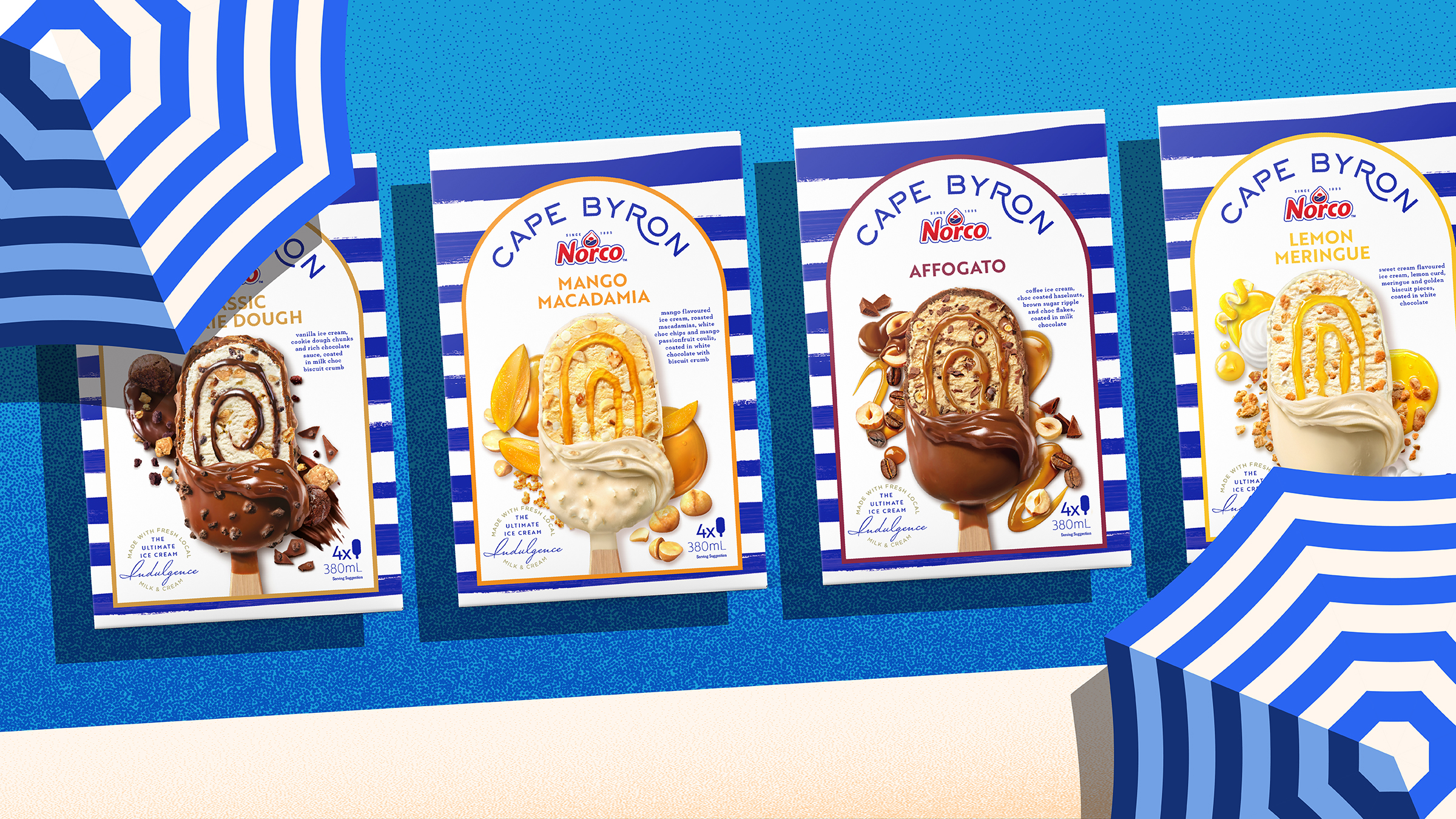
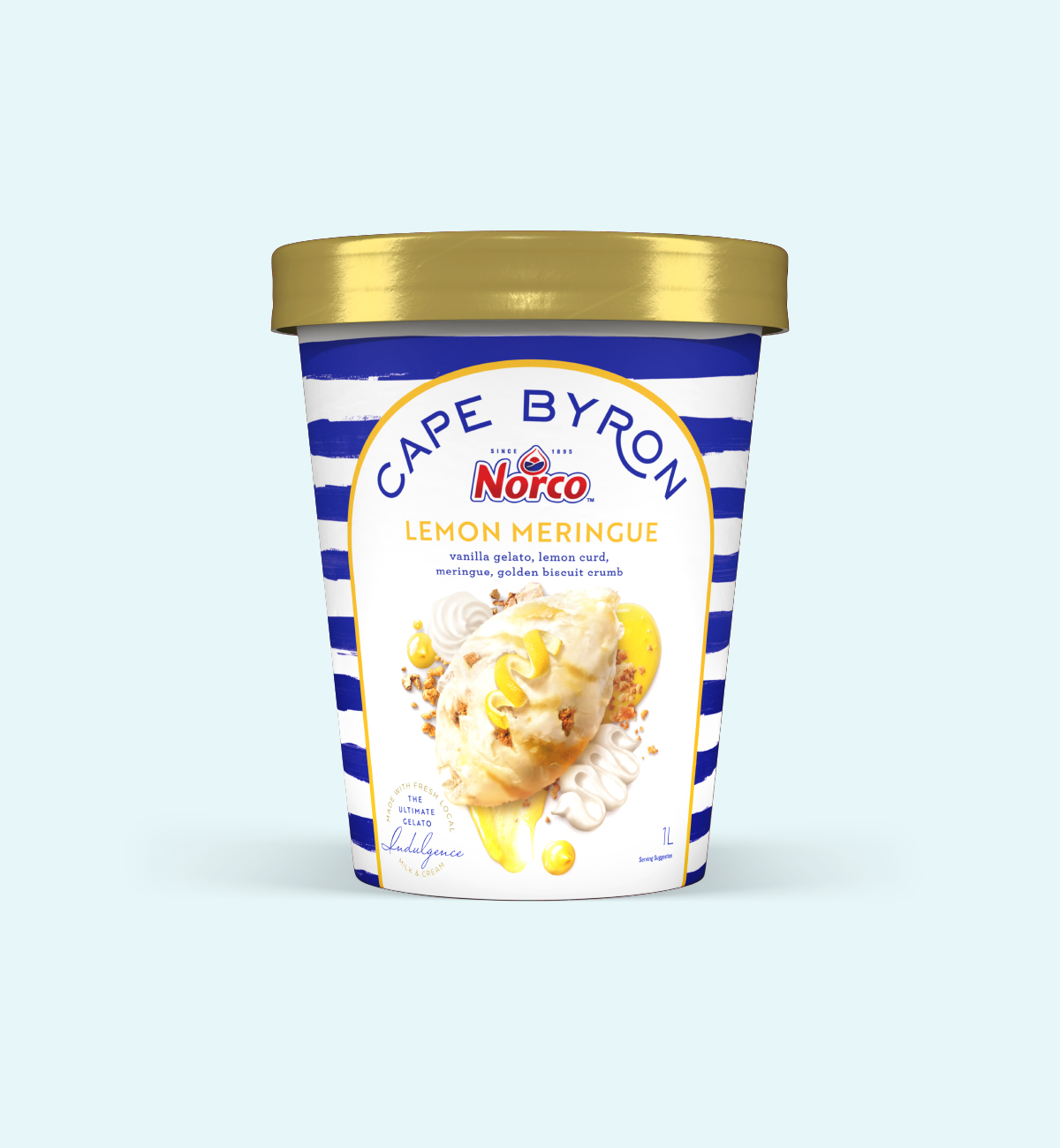
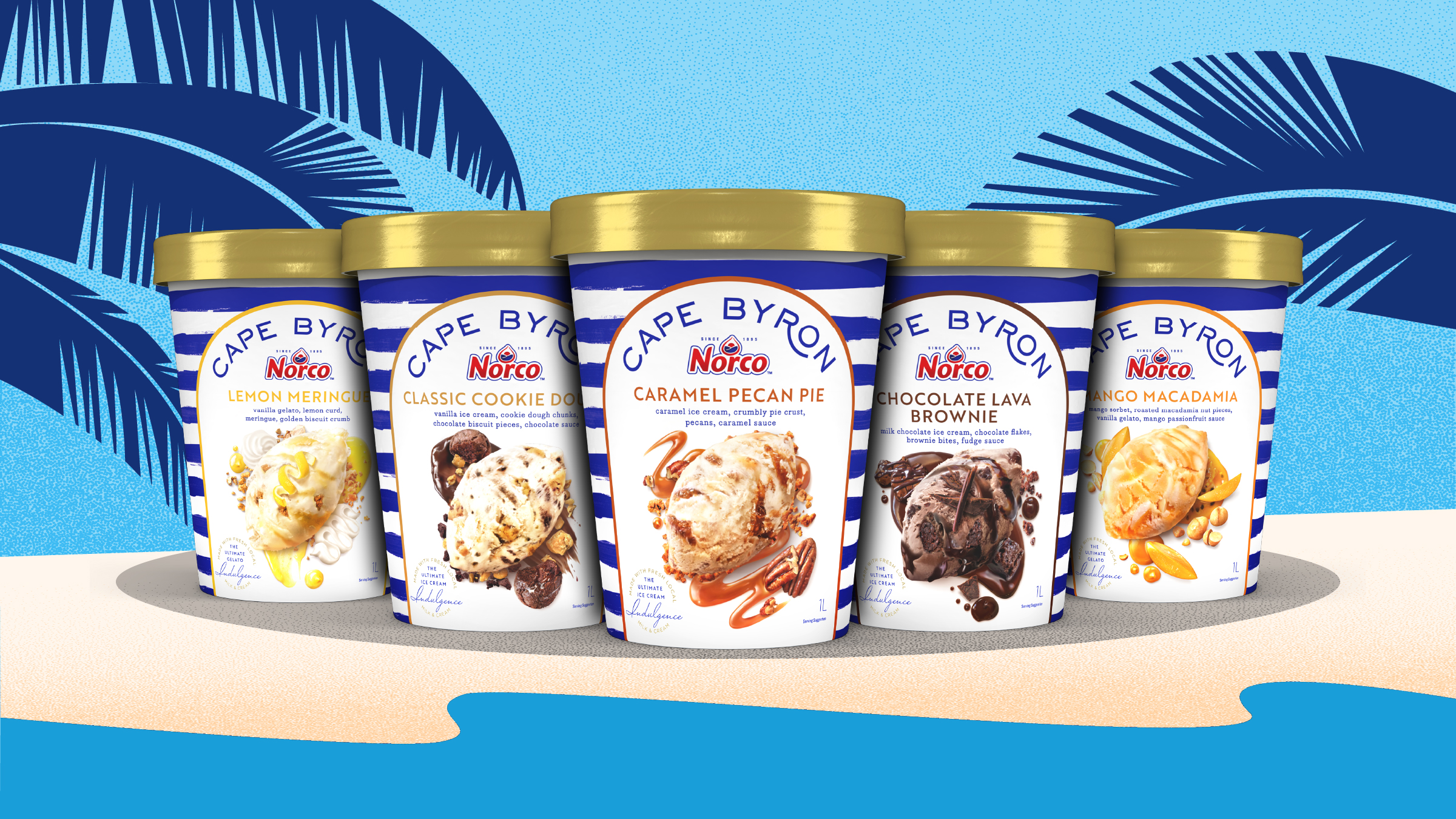
The answer was hiding in plain sight – Byron Bay. Founded there in 1895, Norco’s origin became the springboard for Cape Byron by Norco: a brand designed to evoke barefoot luxury, sensory pleasure, and modern Australian refinement. Every detail – from hand-painted blue-and-white stripes to indulgent flavour storytelling – was crafted to transport, inspire, and delight. This wasn’t just packaging – it was a full-body escape, made from the same high-quality milk Norco is known for.


Cape Byron stepped confidently into a category dominated by global players – and stood apart. With national retail uptake, a successful premium price point, and expanded brand influence across Norco’s portfolio, it has proven that regional provenance can be reimagined with elegance and impact.
Illustration: Anita Xhafer
Awards
Transform ANZ 2025 Silver – Best development of a new brand within an existing brand portfolio

/ “Cape Byron delivers a fresh take on modern Australian luxury with undeniable freezer impact and rich brand codes that set the foundation for Norco’s premium ice cream future.
”