/ a2 Milk USA
- /Packaging Design
Real. Natural. Taste.
The a2 Milk Company has long been a pioneer, reshaping the Australian and New Zealand dairy markets and achieving extraordinary success in China through its infant milk formula. In the United States, however, the brand was still establishing itself in a crowded and complex category. Despite winning over early adopters, barriers remained – from consumer scepticism around the product’s naturalness and purity to the entrenched presence of highly localised, premium niche dairy brands.
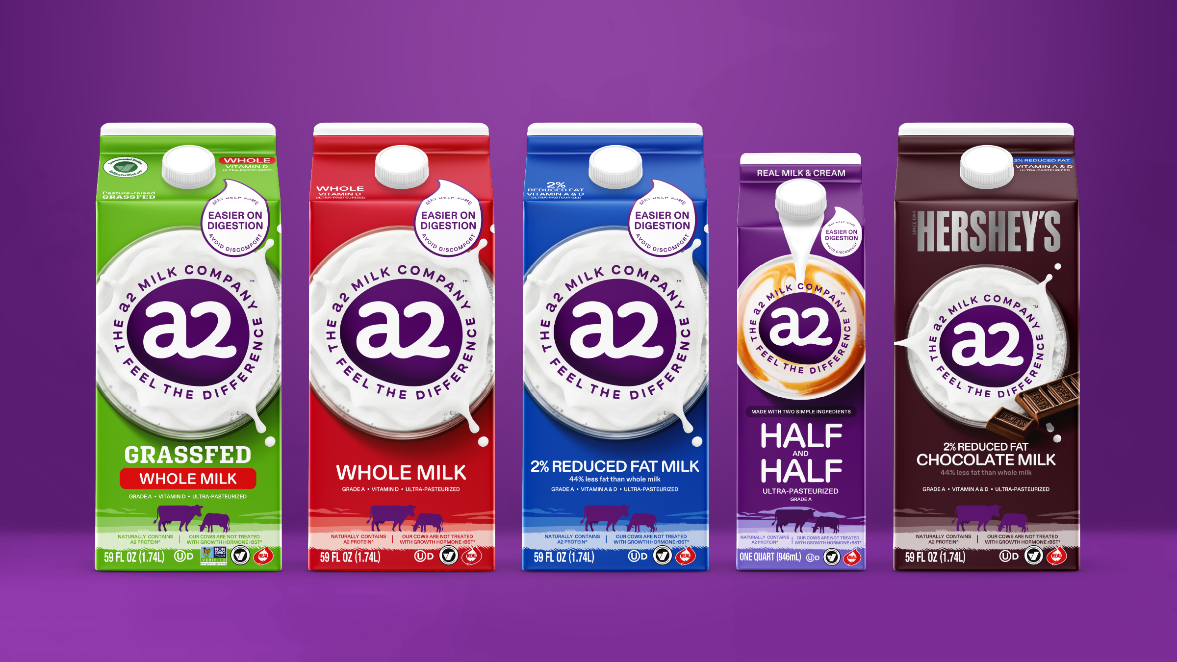
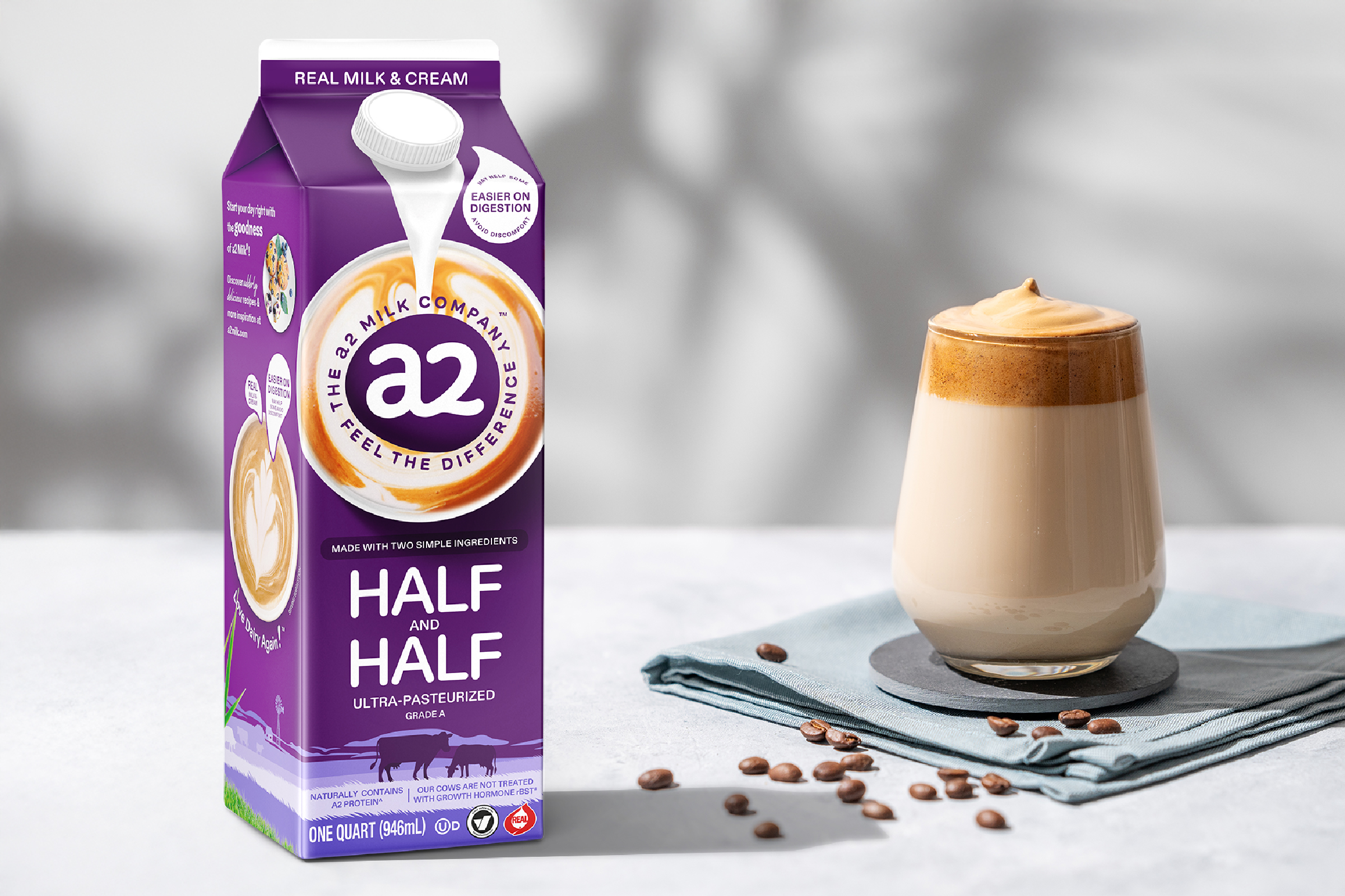
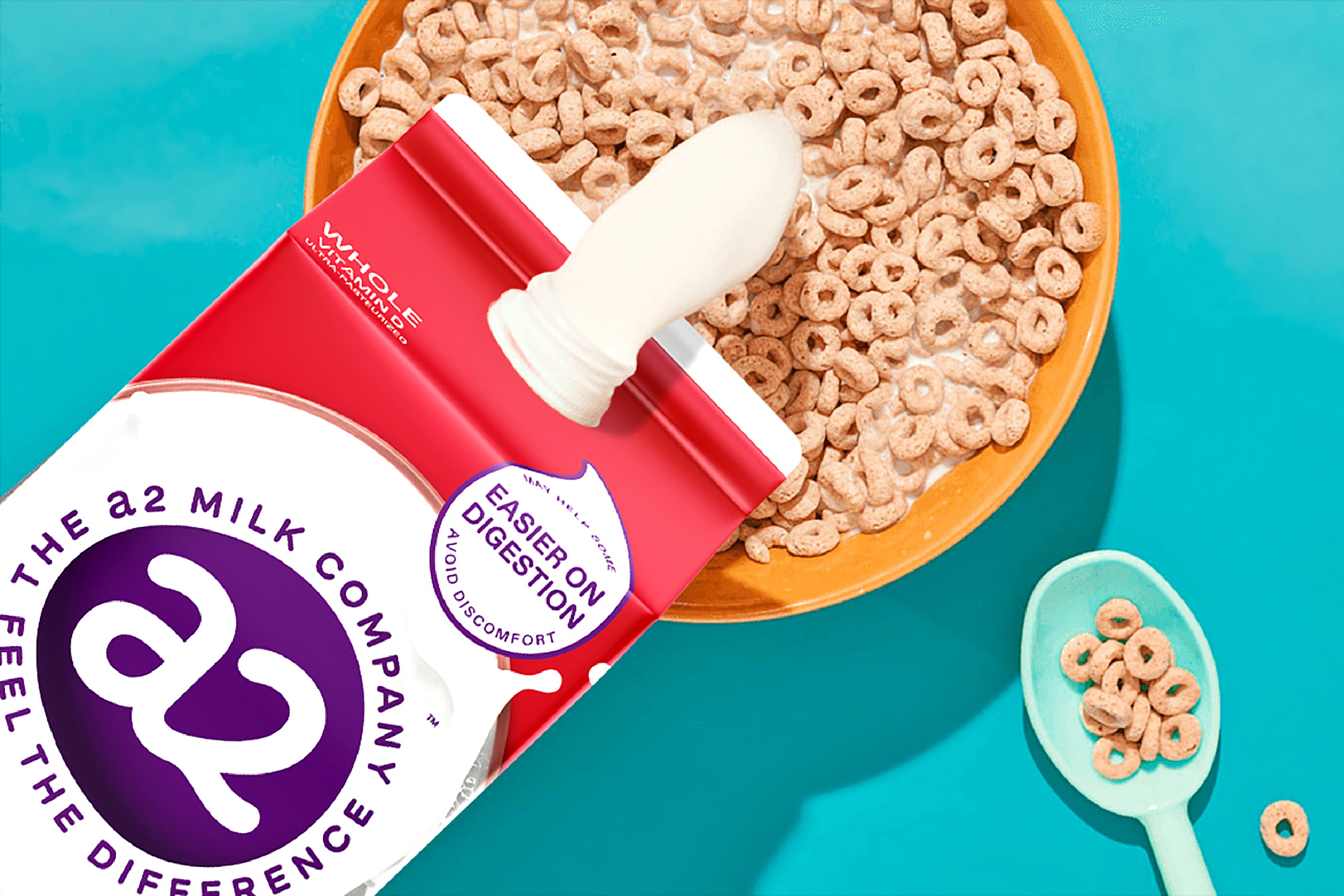
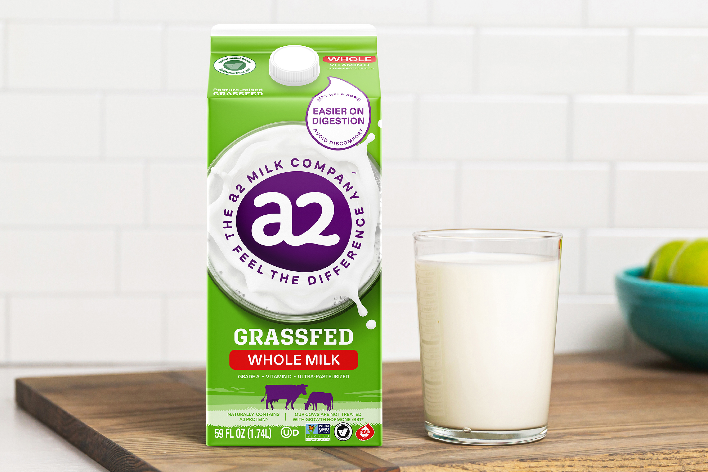
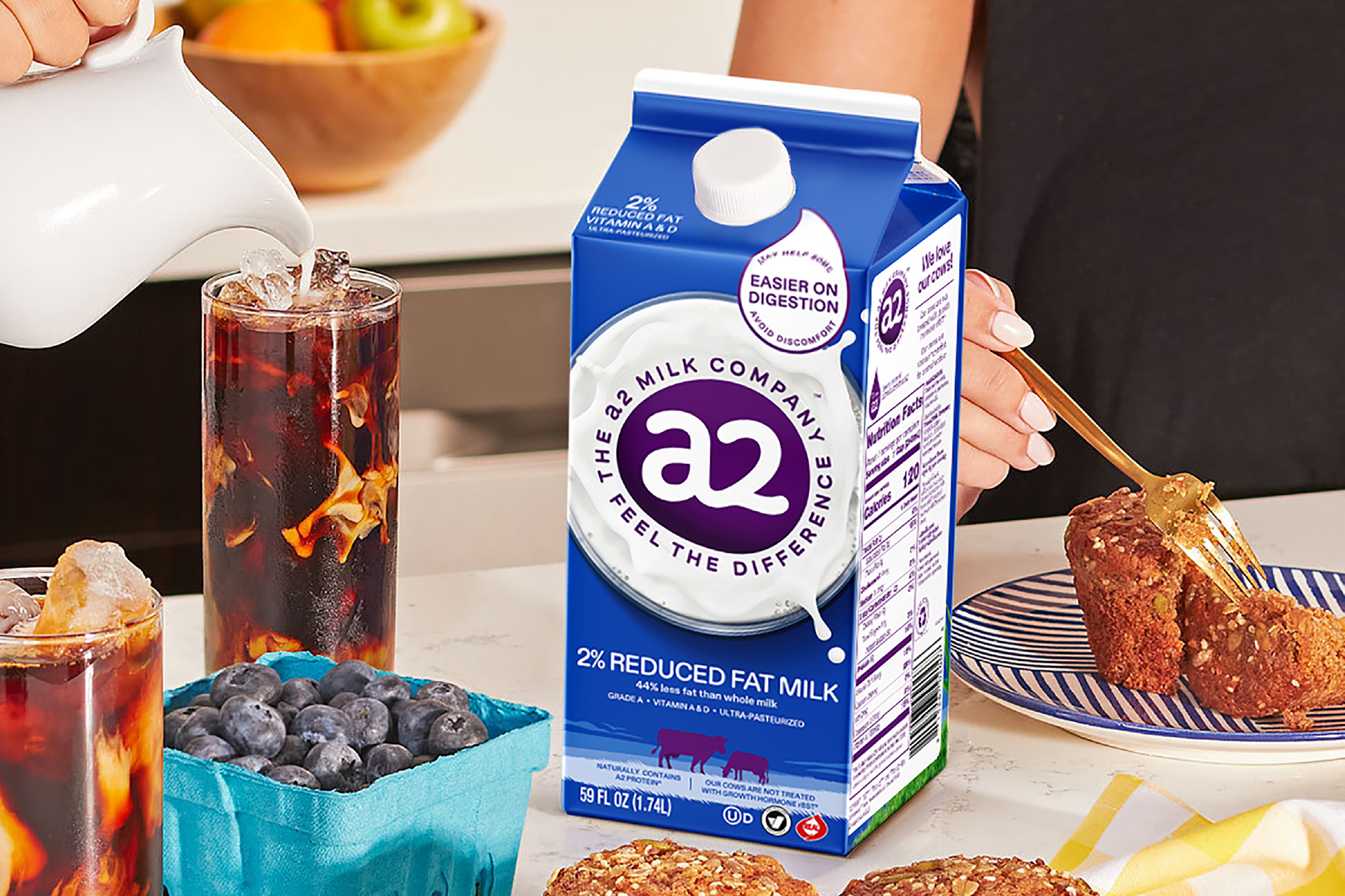
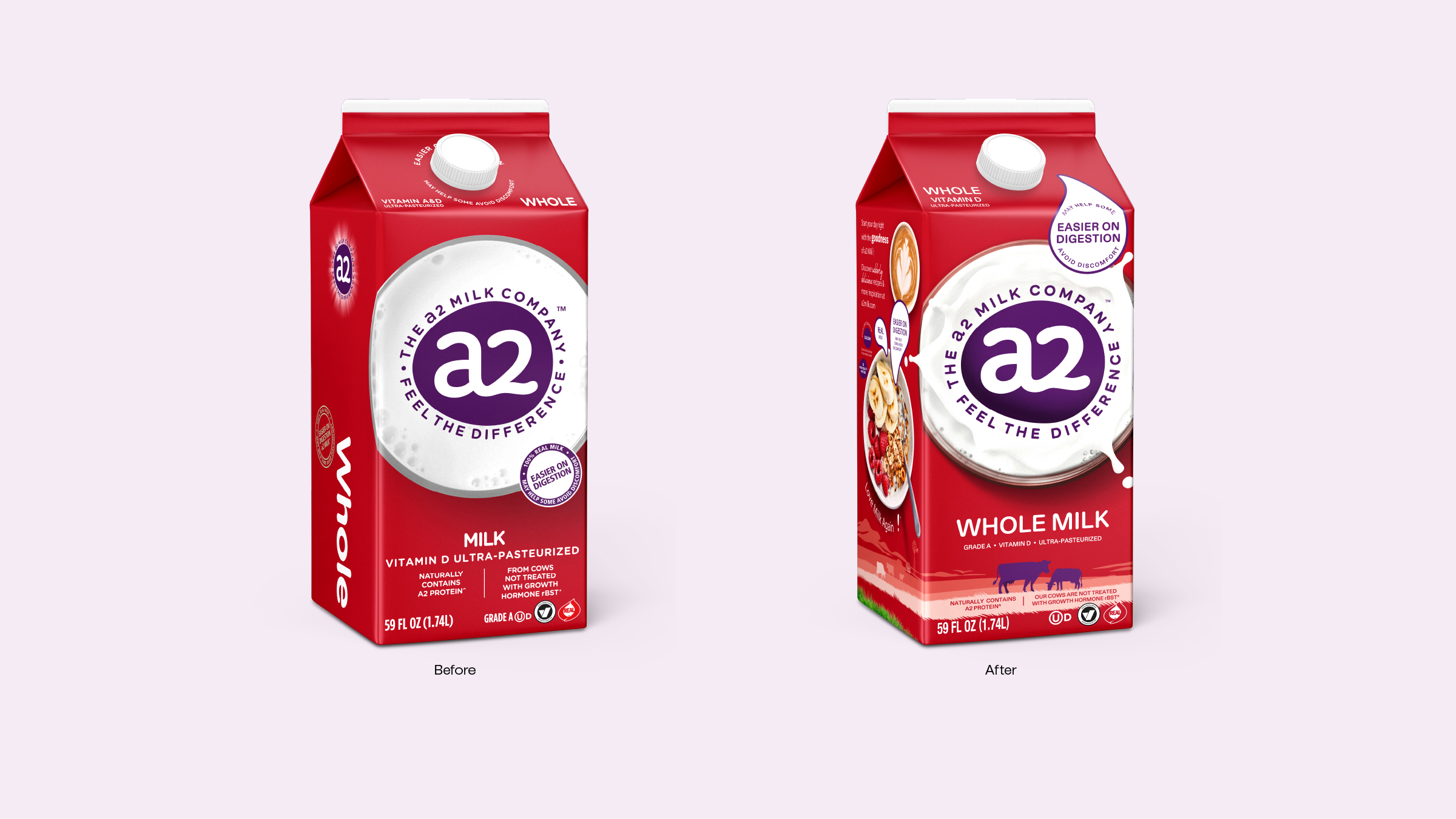
To strengthen its position, a2 Milk required a packaging refresh that could clarify its unique brand promise, reassure consumers on quality and provenance, and deliver a sense of energy and vitality at shelf. Our approach was evolutionary rather than revolutionary. We retained the strong, established variant colours to preserve recognition and trust, while reimagining the static overhead glass of milk into a dynamic splash that expressed freshness, movement, and vitality. This simple but powerful change reinvigorated the pack while heroing the product truth: real, natural milk.
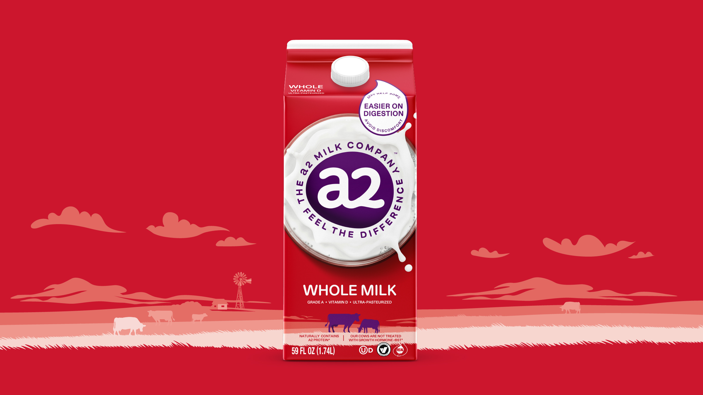
Across the range, silhouettes of grazing a2 Milk cows were introduced to anchor the product in authenticity and provenance, reinforcing the story of naturalness from farm to fridge. Unified layouts brought greater consistency across the portfolio, delivering a stronger shelf block and improved clarity in a fragmented category. The result is a revitalised packaging system that brings coherence, reassurance, and distinction to a2 Milk USA, helping overcome hesitation and establishing the brand as a credible, premium player in the US dairy landscape.