/ King Island Distillery Coastal Gin
- /Brand Strategy
- /Brand Identity
- /Packaging Design
Like nowhere else on earth.
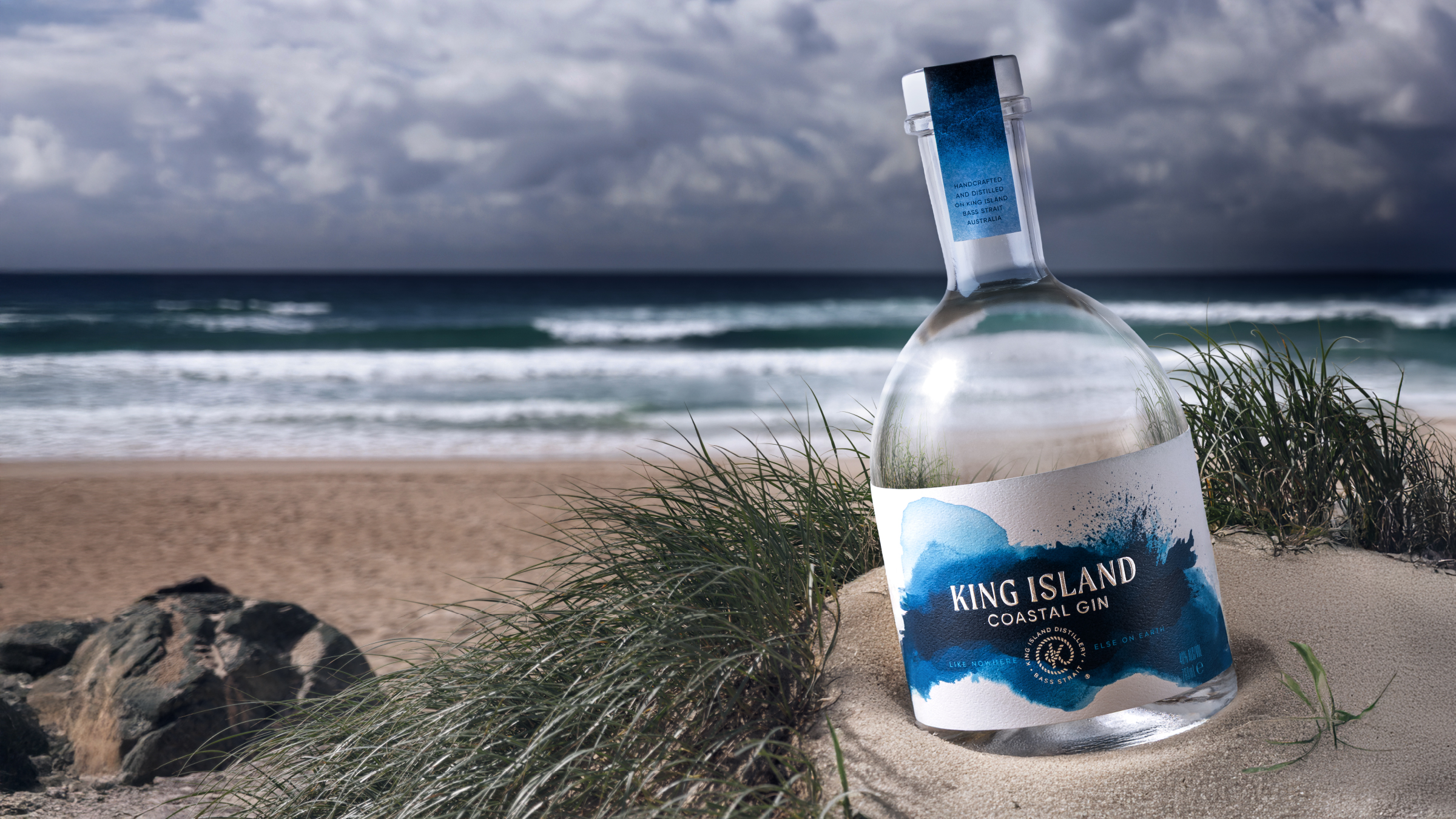
King Island is a place of extremes – pure, wild, and elemental. King Island Coastal Gin captures that essence in its crispest form. Crafted with the world’s purest rainwater and native botanicals foraged from the island’s rugged shoreline, the gin demanded a design as bracing and distilled as the liquid itself.

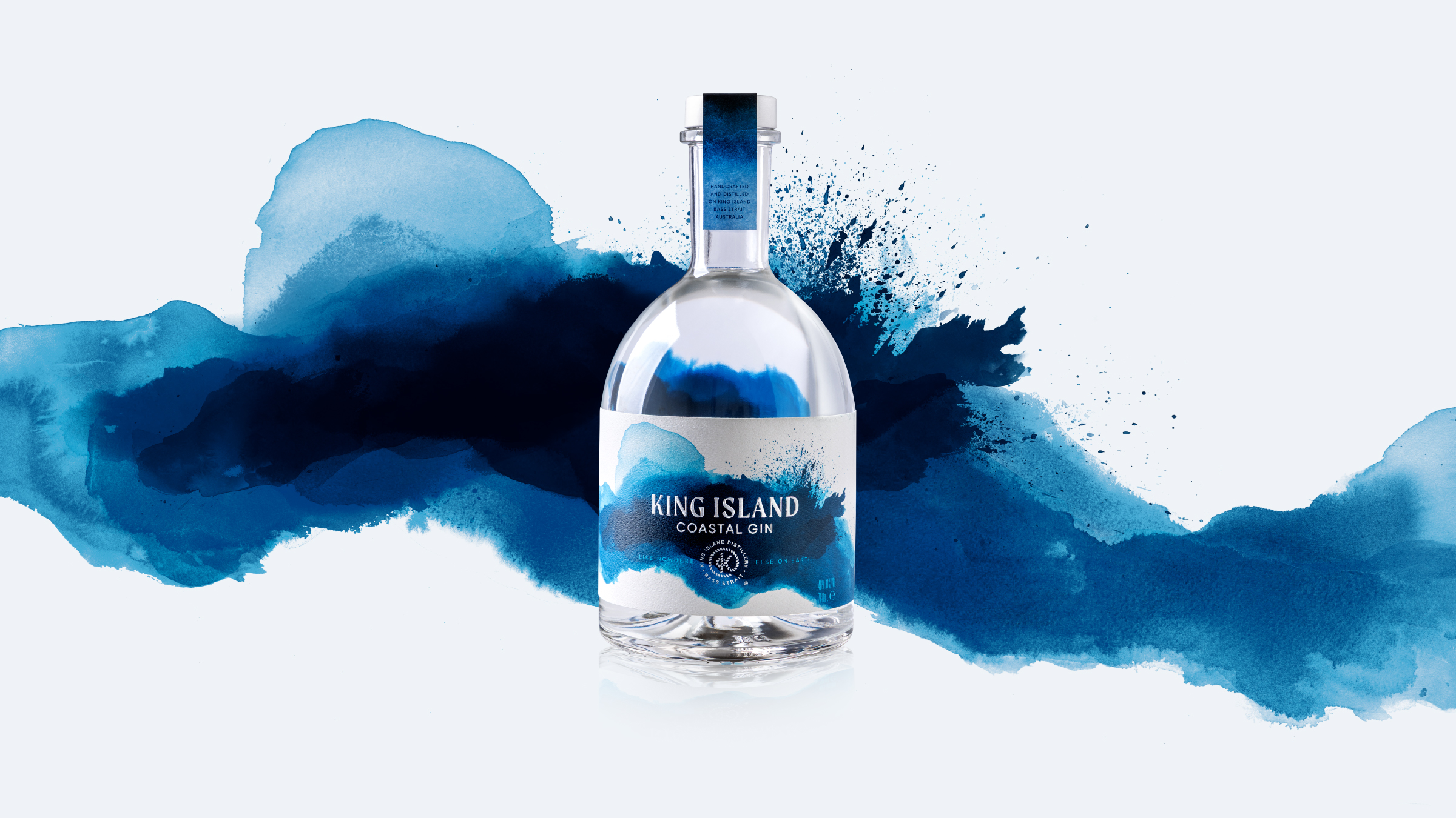
The visual identity rejects complexity in favour of quiet power. A white, textured label wraps the smooth Saverglass Botanic bottle, overlaid with a hand-painted abstraction of crashing waves in icy blues and greys. Typography is minimal. Detail is restrained. Every decision mirrors the gin’s purity – and the serenity of a coastline shaped by wind and water.
The result is a bottle that feels calm, confident and deeply rooted in place. It doesn’t shout for attention – it draws you in. A study in restraint, and a bold statement of clarity.
Awards
Transform ANZ 2025
Silver – Best use of packaging
Silver – Best strategic or creative development of a new brand
Melbourne Royal Australian International Spirits Awards 2025
Silver – Design

/ “Every bottle we make is a tribute to King Island – its stories, its people, and its unforgiving beauty.
”